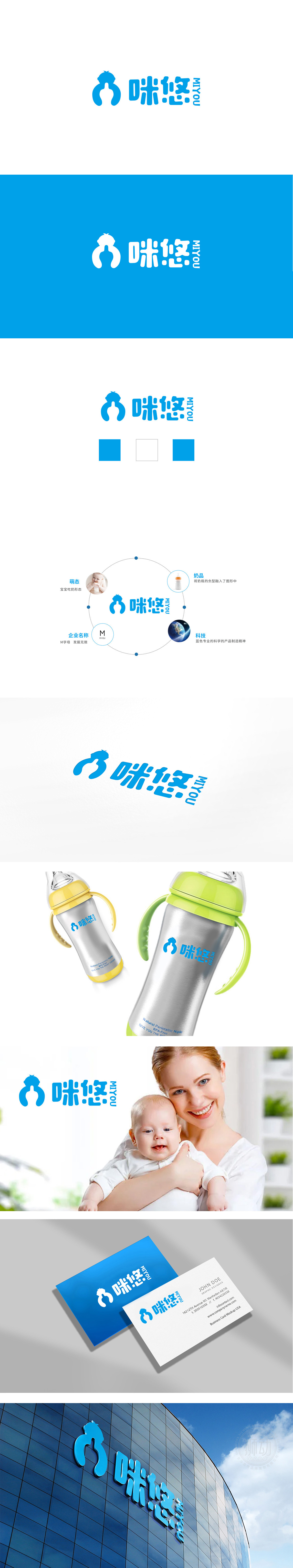
狮动设计以流畅的蓝色曲线构成两个抽象人物轮廓,巧妙形成抱持、守护的姿态,直观传递母婴产品的“陪伴”“关爱”属性。白色负空间(留白)恰好构成了一个奶瓶的剪影——实形传递“人”的情感联结,负形暗藏“产品”功能属性,又让“母婴喂养”这一核心场景在视觉中自然浮现,信息密度高且富有层次感。标志整体轮廓暗合品牌名称首字母“M”,形成“图形+字母”的双重记忆点。整体采用“曲线为主、直线为辅”的视觉语言:曲线呼应婴儿的柔软、母性的温柔;环形和圆点则象征完整、呵护与连接,与母婴场景的“关爱”“守护”主题高度契合。
Lion design forms two abstract figures with smooth blue curves, cleverly forming a gesture of holding and guarding, and intuitively conveying the "companionship" and "care" attributes of maternal and child products. The white negative space (blank space) just constitutes the silhouette of a milk bottle-the real shape conveys the emotional connection of "people", while the negative shape hides the functional attribute of "product", which makes the core scene of "mother-to-child feeding" naturally emerge in the visual sense, with high information density and a sense of hierarchy. The overall outline of the logo coincides with the initial letter "M" of the brand name, forming a double memory point of "graphics+letters".


扫码或拨打添加客服微信


