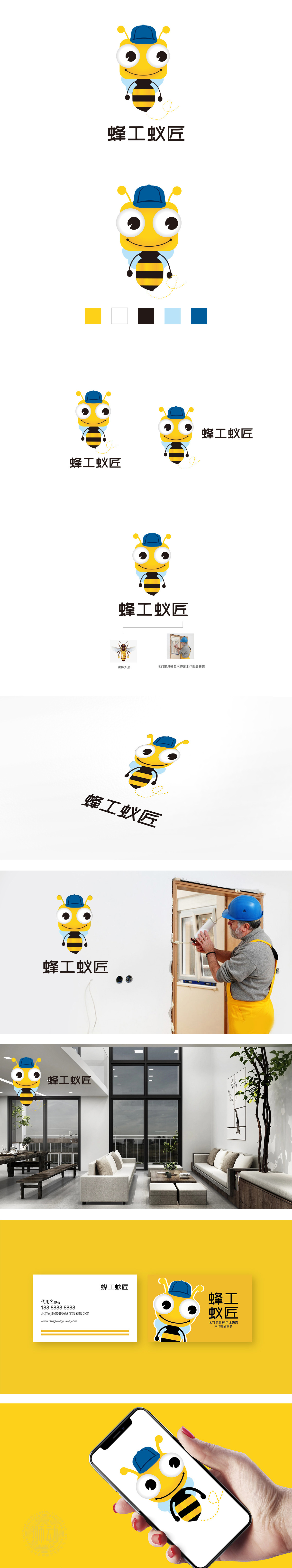
狮动设计采用拟人化蜜蜂形象,黄色主色调明亮温暖,符合家政服务给人“亲切、可靠”的心理预期;蜜蜂的“勤劳、协作、高效”特性,直接映射家政服务中“细致劳作、团队配合”的核心价值;翅膀和触角的细节设计增加灵动性,蚂蚁:品牌名中的“蚁匠”与蜜蜂形成巧妙呼应——蚂蚁象征“专注细节、脚踏实地”,与“匠”字结合,强化“专业匠人精神”,暗示服务不仅是“完成任务”,更是“精工细作”的品质承诺;设计通过动物意象的巧妙融合、人格化的细节处理,以及色彩与字体的行业化适配,成功塑造了一个“专业又亲切、勤劳且细致”的家政服务品牌形象。
Lion design adopts anthropomorphic bee image, and the main color of yellow is bright and warm, which conforms to the psychological expectation that domestic service gives people "kindness and reliability"; The characteristics of bee's "diligence, cooperation and high efficiency" directly reflect the core value of "meticulous work and teamwork" in domestic service; The detailed design of wings and tentacles increases agility. Ant: The "ant craftsman" in the brand name echoes the bee skillfully-ant symbolizes "attention to detail and down-to-earth", which combines with the word "craftsman" to strengthen the "professional craftsman spirit", suggesting that service is not only "completing the task", but also the quality commitment of "meticulous work".


扫码或拨打添加客服微信


