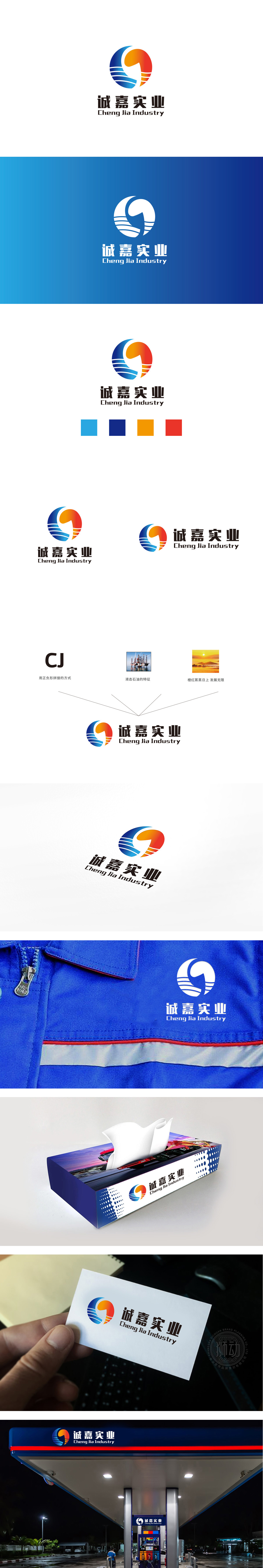
狮动设计采用正负形拼接的方式简化了品牌首字母:C的曲线与J的直线形成虚实对比,既保留了字母的识别性,又通过极简造型降低了记忆成本。 同时把“行业属性”变成“可触摸的图形”(液态石油:从特征到符号),蓝白波浪纹,则是把“液态石油”的特征做了抽象化处理——波浪的流动感对应石油的“液态”本质,蓝白配色又暗合“海上作业”的场景(海洋+石油)。更妙的是,波浪纹不是孤立的:它与右侧“橙红日出”的渐变色形成呼应,把“石油”这个冷感的行业特征,变成了有温度的“生长感”。这种“精准传递+自然融合”的能力,就是图形设计的“加油站”:它给品牌注入了“能被看见、能被记住、能被共情”的动力,让品牌在观者心中“活”了起来。
Lion design simplifies the brand initials by combining the positive and negative shapes: the curve of C and the straight line of J form a contrast between reality and reality, which not only retains the recognition of letters, but also reduces the memory cost through minimalist modeling. At the same time, the "industry attribute" is changed into a "touchable figure" (liquid oil: from characteristics to symbols), and the blue-white wavy pattern abstracts the characteristics of "liquid oil"-the flowing feeling of waves corresponds to the "liquid" essence of oil, and the blue-white color scheme coincides with the scene of "offshore operation" .


扫码或拨打添加客服微信


