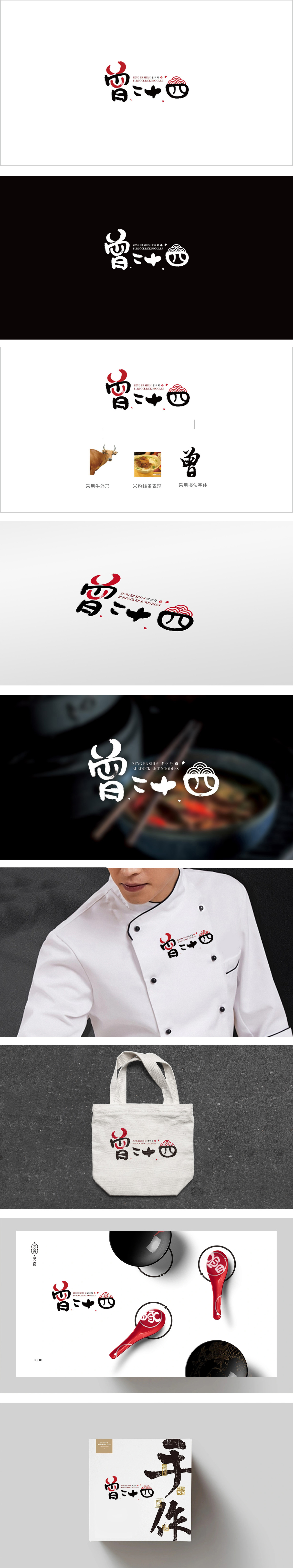
狮动设计采用手写书法传承感:通过“书法字体”“云纹圆章”“曾字号”文字,直接传递“这是一家有历史的老店”,让消费者对“味道的稳定性”产生信任;“曾”字的红色弧形笔触是点睛之笔——既像“传承的火焰”,又似“米粉的热气”,将“传统”与“餐饮的烟火气”结合,强化了“家的味道”的联想。“曾”字的红色笔触、云纹的层叠效果,都模拟了“米粉的热气”“汤汁的流动”,让静态的标识有了“动态的烟火气”;狮动为“曾二十四”做的这套设计,刚好踩中了中式餐饮的“情绪共鸣密码”:用“传统符号的当代重构”,把“老字号的传承”“米粉的烟火气”“年轻人的审美”揉成了一颗“视觉炸药”,一炸就炸进心里。
Lion Design adopts the sense of hand-written calligraphy inheritance: it directly conveys "this is an old shop with history" through the words of "calligraphy font", "moire seal" and "Zeng font size", so that consumers can have trust in "taste stability"; The red arc brushwork of the word Zeng is the finishing touch-it is both like the flame of inheritance and the heat of rice noodles, which combines tradition with the fireworks of catering and strengthens the association of the taste of home. The red strokes of the word "Zeng" and the layered effect of moire all simulate the "hot air of rice noodles" and "the flow of soup".


扫码或拨打添加客服微信


