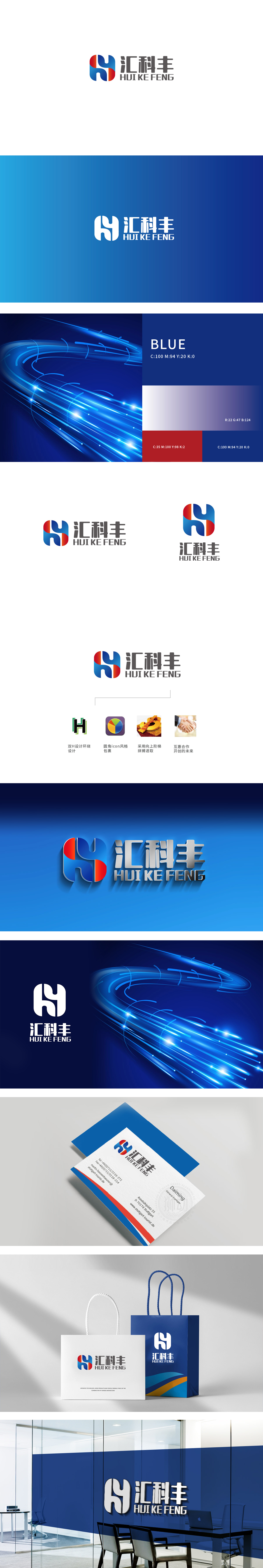
狮动设计以企业名称首字母“HK”为创意基础,通过曲线与几何切割巧妙融合,整体呈现环形包裹感,象征企业的“汇聚”(汇)与“科技整合”(科)属性。色彩搭配:红色(热情、活力)与蓝色(科技、专业)形成鲜明对比,视觉冲击力强。线条与形态:体现品牌的包容性与成长性,高饱和撞色,传递科技、活力的品牌调性。
Lion Design is based on the initial letter "HK" of the enterprise name, and it presents a sense of circular package through the ingenious combination of curve and geometric cutting, symbolizing the attributes of "convergence" and "scientific and technological integration" of the enterprise. Color matching: Red (enthusiasm and vitality) is in sharp contrast with blue (technology and specialty), which has strong visual impact. Lines and forms: reflect the brand's inclusiveness and growth, high saturation and contrast, and convey the brand tonality of science and technology and vitality.


扫码或拨打添加客服微信


