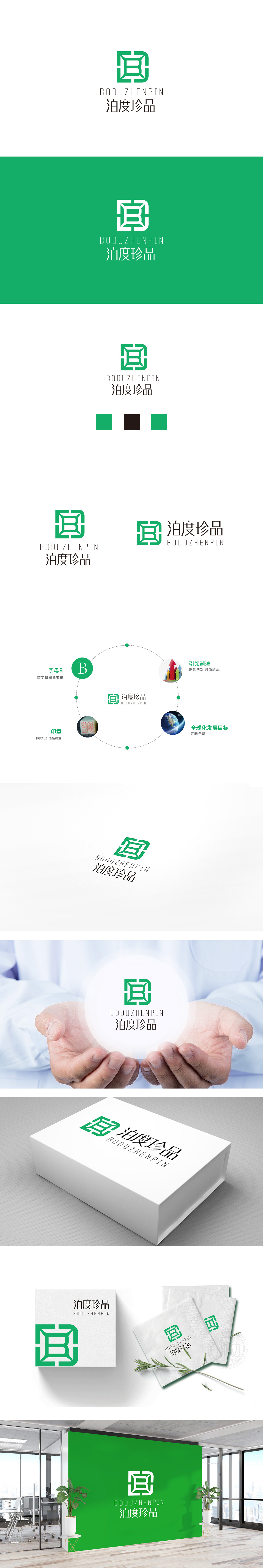
狮动设计通过绿色的几何变形“B”变形,结合方形边框:方形象征“稳定、可信”,符合保健品消费者对“安全”的核心需求;嵌套菱形/立体盒状结构:菱形的折角与立体效果模拟了“珠宝盒”或“珍贵物品”的视觉联想,直接呼应“珍品”的品牌后缀,强化“高端、稀缺”的产品定位;左右对称的结构带来平衡感,符合传统审美中的“和谐”,进一步传递“可靠”的品牌形象。绿色是保健品行业的“视觉母语”,天然关联“自然、健康、生机”,整体用抽象的几何语言传递具体的品牌价值,把“泊度珍品”的“高端健康”属性转化为可感知的视觉符号。
Lion design is transformed by green geometric deformation "B" and combined with square frame: square symbolizes "stability and credibility", which meets the core demand of health care consumers for "safety"; Nested diamond/three-dimensional box structure: the folding angle and three-dimensional effect of diamond simulate the visual association of "jewelry box" or "precious items", directly echo the brand suffix of "treasures" and strengthen the product positioning of "high-end, scarce"; The symmetrical structure brings a sense of balance, which conforms to the "harmony" in traditional aesthetics and further conveys the "reliable" brand image. Green is health care industry's "visual mother tongue".


扫码或拨打添加客服微信


