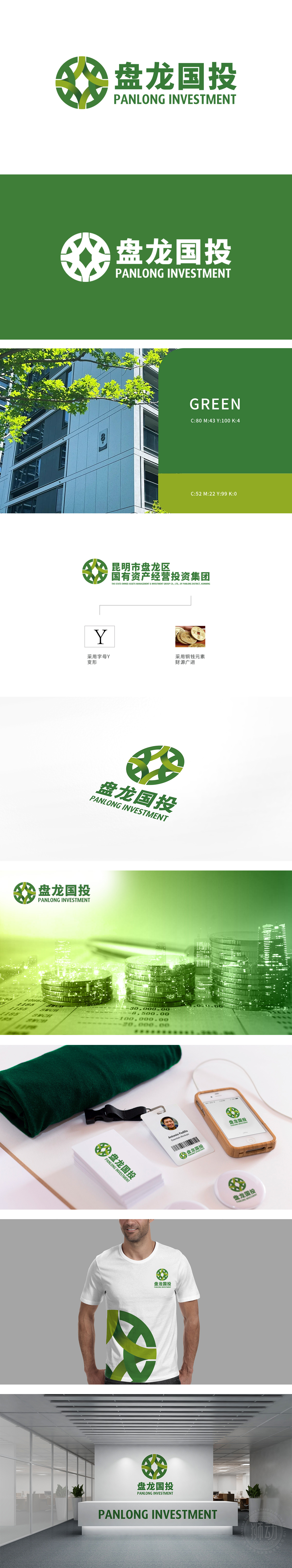
狮动为盘龙国投设计的LOGO完美融合金融财务行业的稳健与创新理念。团队深入挖掘“盘龙”意象,以交织的绿线条构建动态圆形,象征资本循环与永续发展;绿色主色调传递生机与信赖。字体设计简洁专业,中英文搭配强化国际视野,客户对狮动精准的行业洞察与美学表达高度赞赏。
The LOGO designed by Lion Motion for Panlong Guotou perfectly integrates the sound and innovative ideas of the financial industry. The team dug deep into the image of "Panlong" and constructed a dynamic circle with intertwined green lines, symbolizing capital circulation and sustainable development; The main color of green conveys vitality and trust. The font design is concise and professional, and the combination of Chinese and English strengthens the international vision.


扫码或拨打添加客服微信


