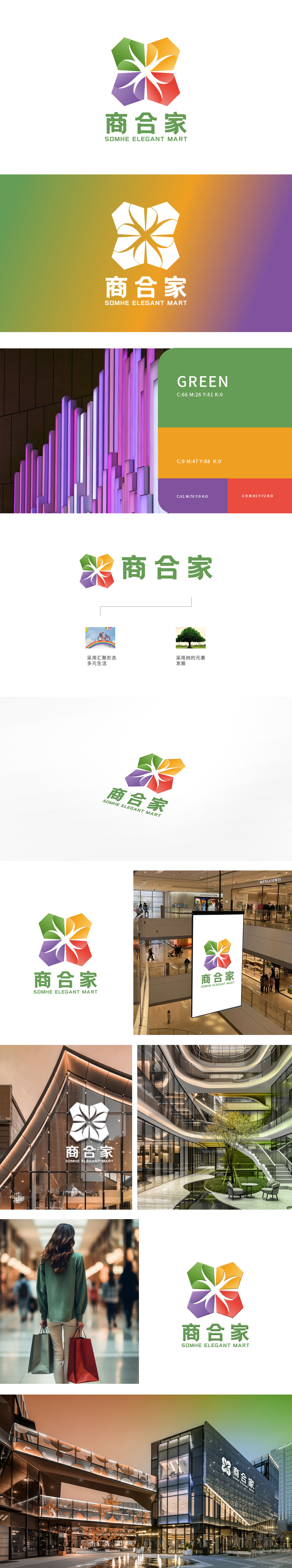
狮动为“商合家”商业街打造品牌LOGO。狮动紧扣“烟火聚合、业态共生”定位,以四色几何模块拼构花型——绿橙紫红对应生活、文创、休闲、零售多元场景,中心放射线条传递开放活力;下方“商合家”字体清新亲和,英文强化格调。营造商业街的热闹与质感。
Lion moves to create a brand LOGO for the "Shanghejia" commercial street. Lions closely follow the positioning of "fireworks aggregation and business symbiosis", and construct flower patterns with four-color geometric modules-green, orange, purple and red corresponding to multiple scenes of life, cultural creation, leisure and retail, and the central radiation lines convey open vitality.


扫码或拨打添加客服微信


