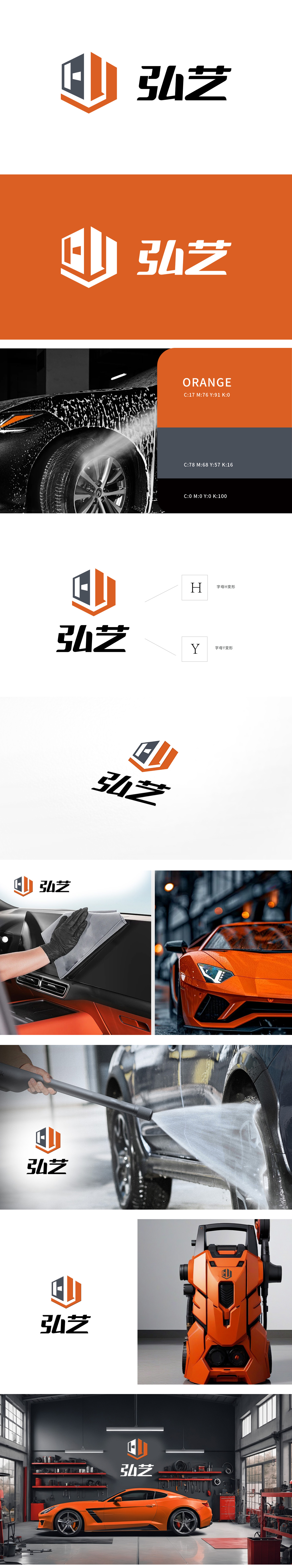
狮动以六边形为视觉核心(呼应工业精密性与服务稳定性),橙灰撞色平衡与“技术可靠感”;“弘艺”字体做几何化处理,强化机械属性与记忆点。LOGO落地后,新客户参观时直言:“从图形到色彩,狮动把汽车行业特质吃透了,设计里藏着对专业的理解,这能力不服不行!”
Lion Dance takes hexagon as its visual core (echoing industrial precision and service stability), and orange and gray contrast balance "maintenance vitality" and "technical reliability"; "Hongyi" font is geometrically processed to strengthen mechanical properties and memory points. After the LOGO landed, new customers bluntly said when they visited: "From graphics to colors, Lion has thoroughly understood the industry characteristics of auto parts repair, and there is an understanding of professionalism hidden in the design. This ability is not acceptable!"


扫码或拨打添加客服微信


