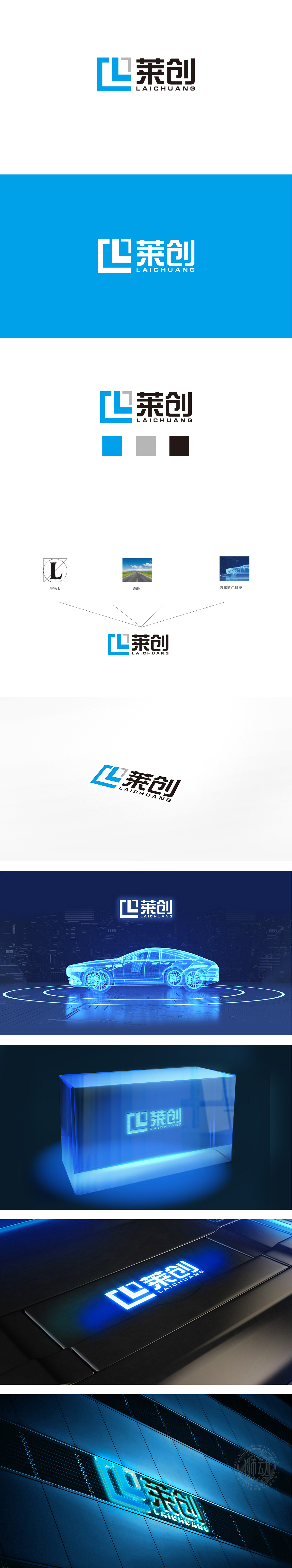
狮动设计通过“L+C”的抽象组合**,形成了类似“电路模块”“芯片切面”的视觉联想——蓝色块的拼接方式模拟了电子元件的“模块化结构”,符合电子行业“精密、理性”的特质;灰白色的小方块作为点缀,既打破了纯蓝色的单调,又暗含“电子信号”“数据交互”的隐喻,强化了“科技感”。 用“蓝黑组合”构建“专业与可靠”的品牌调性,深蓝色:是电子、科技行业的经典用色,传递“专业、冷静、未来感”。这种“以字母为骨、以行业特征为魂”的设计,用极简的图形传递了品牌的核心属性,体现“图形+文字”的组合实现“视觉锤”效应。
Lion Design has formed a visual association similar to "circuit module" and "chip section" through the abstract combination of "L+C"-the splicing mode of blue blocks simulates the "modular structure" of electronic components, which conforms to the characteristics of "precision and rationality" in the electronic industry; As an ornament, the small gray squares not only break the monotony of pure blue, but also imply the metaphor of "electronic signal" and "data interaction", and strengthen the sense of science and technology. The brand tonality of "professionalism and reliability" is built with the combination of "blue and black". Dark blue is a classic color used in electronics and technology industries, conveying "professionalism, calmness and futurity".


扫码或拨打添加客服微信


