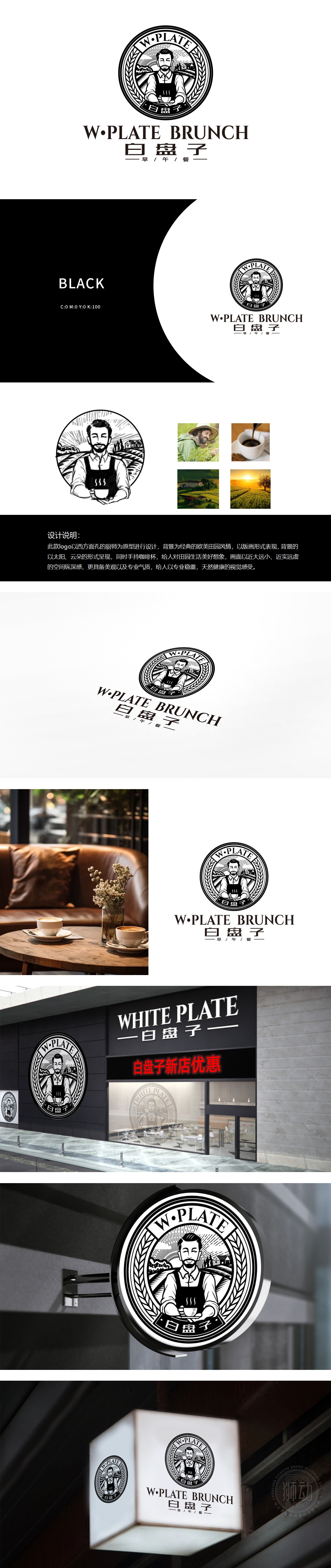
狮动为W·PLATE白盘子打造的logo,以质朴版画风格诠释餐饮品牌内核。设计中,身着围裙的人物捧着热杯,勾勒出温馨服务形象;乡村风景与麦穗元素交织,传递自然与丰收的叙事。通过黑白手绘质感,将烟火气凝练为视觉符号,精准呼应品牌定位。该方案获客户高度认可,展现狮动以故事驱动设计、打造深度品牌记忆的专长。
The logo created by Lion Motion for W·PLATE white plate interprets the core of catering brand with simple printmaking style. In the design, people in aprons hold hot cups to outline the image of warm service; Rural scenery interweaves with wheat ear elements, conveying the narrative of nature and harvest. Through the black-and-white hand-painted texture, the fireworks are condensed into visual symbols, which accurately echoes the brand positioning.


扫码或拨打添加客服微信


