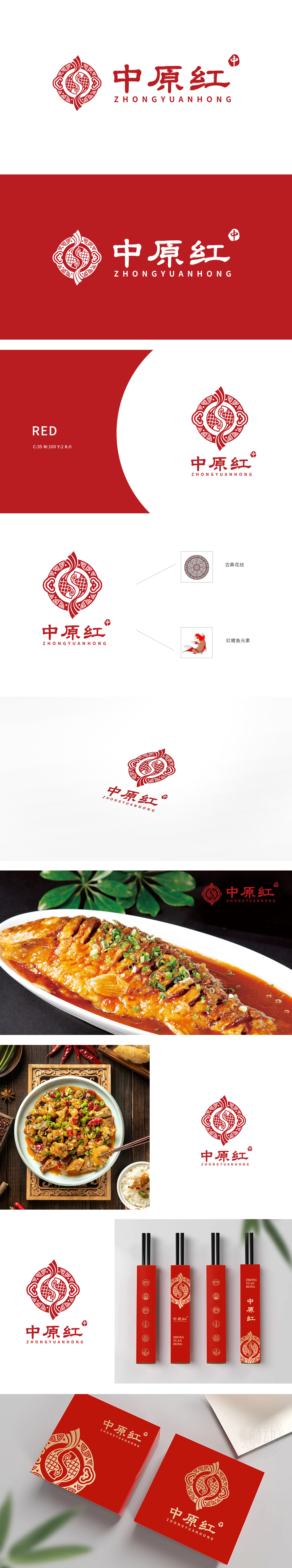
狮动为餐饮品牌“中原红”匠心打造logo。以双鱼缠绕象征食材交融与团圆文化,鳞片纹理彰显品质;云纹与几何图案融合传统与现代,红色主调激发食欲。右下角“中”字印章点睛,强化品牌东方底蕴。整体设计在传递温暖活力的用餐氛围同时,成功塑造了极具记忆点的视觉符号,助力品牌快速建立市场认知。
Lion moves to create a logo for the catering brand "Zhongyuan Red". The twining of Pisces symbolizes the blending of ingredients and reunion culture, and the scale texture highlights the quality; Moire and geometric patterns combine tradition and modernity, and the red theme stimulates appetite. The "Zhong" seal in the lower right corner is the finishing touch to strengthen the brand's oriental heritage.


扫码或拨打添加客服微信


