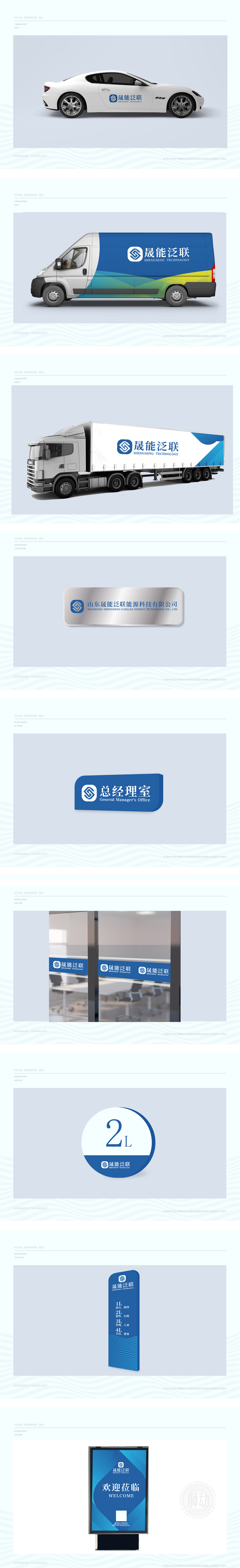
狮动受晟能泛联委托设计品牌LOGO。基于化工能源行业特性,我们以“安全、创新、可持续”为核心,将企业首字母“S”“G”抽象化为动态能量流符号,融入蓝色科技主色调。logo左侧图形如能量矩阵,传递稳健与创新;右侧中英文简洁搭配,强化国际视野。客户高度认可设计方案,认为其精准传递品牌价值。
Lion Motion was commissioned by Shengneng Fanlian to design the brand LOGO. Based on the characteristics of chemical energy industry, we take "safety, innovation and sustainability" as the core, abstract the initials "S" and "G" into dynamic energy flow symbols, and blend them into the main color of blue technology. The graphics on the left side of logo, such as energy matrix, convey robustness and innovation;


扫码或拨打添加客服微信


