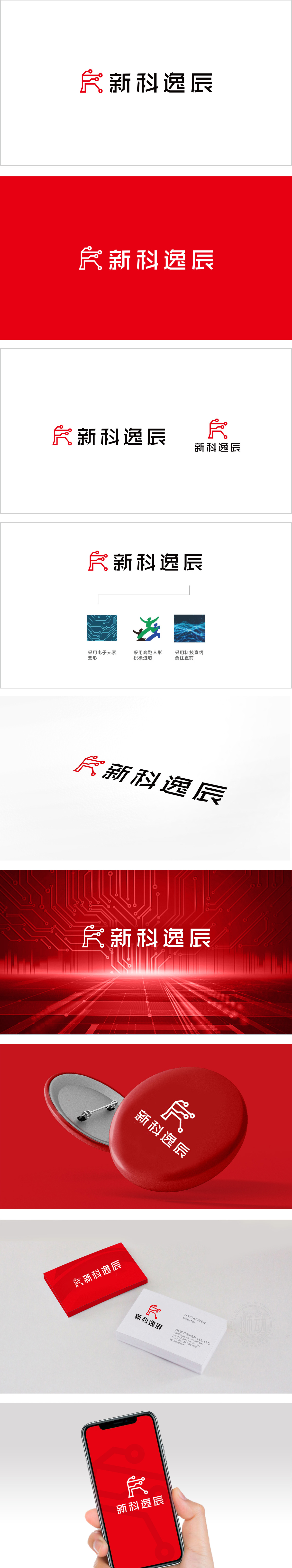
狮动设计采用「电路系统」为核心意象,直接点出「科技公司」的行业属性。线条采用极简几何风格,既像「电阻」「芯片引脚」等电子元件的简化,又隐含「新」字的左侧结构,实现了「行业符号」与「品牌名称」的巧妙融合;圆形节点的加入打破了线条的生硬感,增添了「连接」「灵动」的科技感。「红色+ 黑色的经典组合,既有「科技感」(黑=专业),又有「创新感」(红=活力)。整体用「极简元素+强符号感+深层隐喻」传递「创新」(新科技、新体验)的品牌核心。
Lion design adopts "circuit system" as the core image, directly pointing out the industry attribute of "technology company". The lines adopt minimalist geometric style, which not only simplifies electronic components such as "resistor" and "chip pin", but also implies the left structure of the word "new", realizing the ingenious integration of "industry symbol" and "brand name"; The addition of circular nodes breaks the stiffness of lines and adds a sense of science and technology of "connection" and "agility". The classic combination of red and black has both a sense of science and technology (black = professionalism) and a sense of innovation (red = vitality).


扫码或拨打添加客服微信


