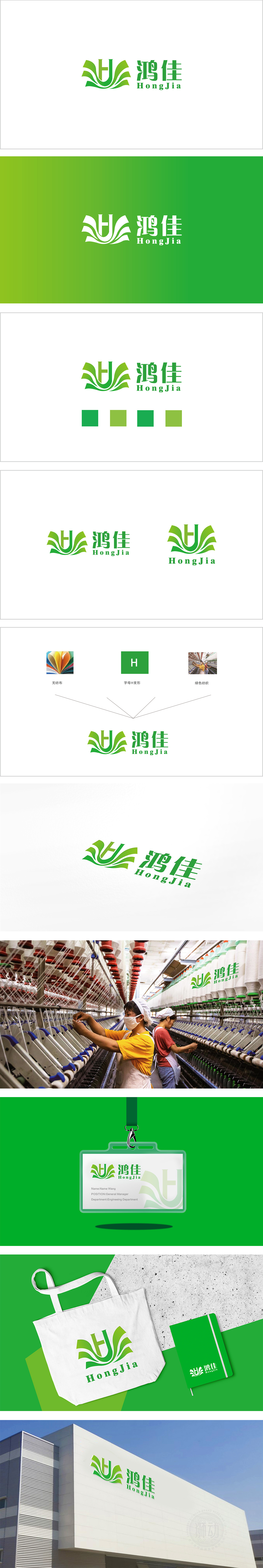
狮动设计以品牌首字母“H”为骨架,通过多层叶片/翅膀形状**的叠加,形成“展开”的动态感,叶片的层次感类似纺织品的叠层设计,曲线流畅的轮廓模拟了纺织品的垂坠感,传递“轻盈、透气”的联想;叶片元素本身关联“自然”,呼应纺织品行业环保、有机的趋势。采用低饱和度绿色系(浅绿→深绿渐变),搭配圆润流畅的线条,风格偏向清新、自然、现代,符合纺织品行业对“舒适、亲和、有温度”的视觉需求:整体用自然元素连接品牌与行业,用视觉符号传递纺织品的质感与情感,实现了“品牌识别”与“行业适配”的平衡与统一。
Lion Lion design takes the brand initials * * "H" as the skeleton, and through the superposition of multi-layer blade/wing shapes , the dynamic feeling of "unfolding" is formed, and the layering of blades is similar to the laminated design of textiles.The smooth contour of the curve simulates the drape of textiles and conveys the association of "lightness and breathability";The leaf element itself is related to "nature", echoing the trend of environmental protection and organic textile industry. The low-saturation green system (light green → dark green gradient) and smooth lines are adopted.


扫码或拨打添加客服微信


