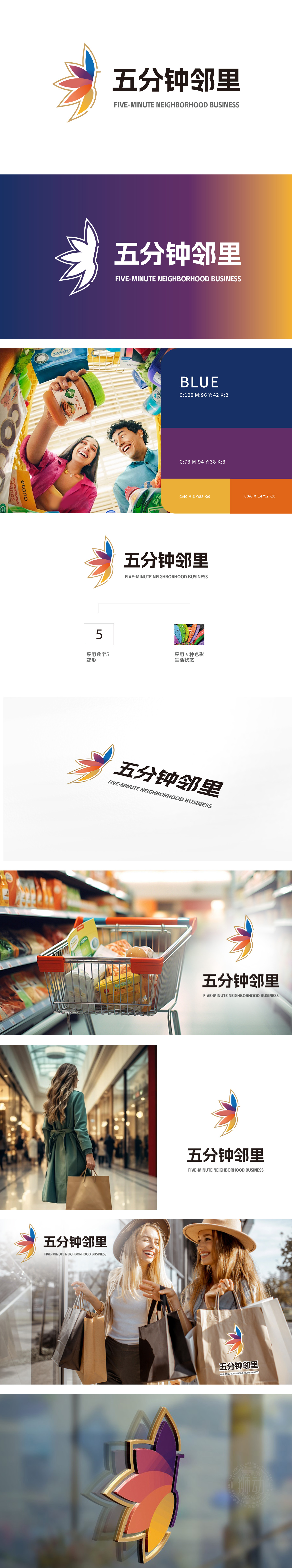
狮动团队精准捕捉核心需求,以五瓣花为视觉核心,象征多元服务与五分钟便民服务圈连接;渐变色彩融合活力与温馨,金色勾勒彰显品质感。右侧中英文字体简洁大气,强化品牌国际化定位。客户对设计方案高度认可,称赞狮动“既把握商业属性,又传递社区温度,完美契合项目定位”。
The lion movement team accurately captures the core needs, with five petals as the visual core, symbolizing the connection between multi-service and five-minute convenience service circle; The gradient color blends vitality and warmth, and the golden outline highlights the sense of quality. The Chinese and English fonts on the right are concise and atmospheric, which strengthens the international positioning of the brand.


扫码或拨打添加客服微信


