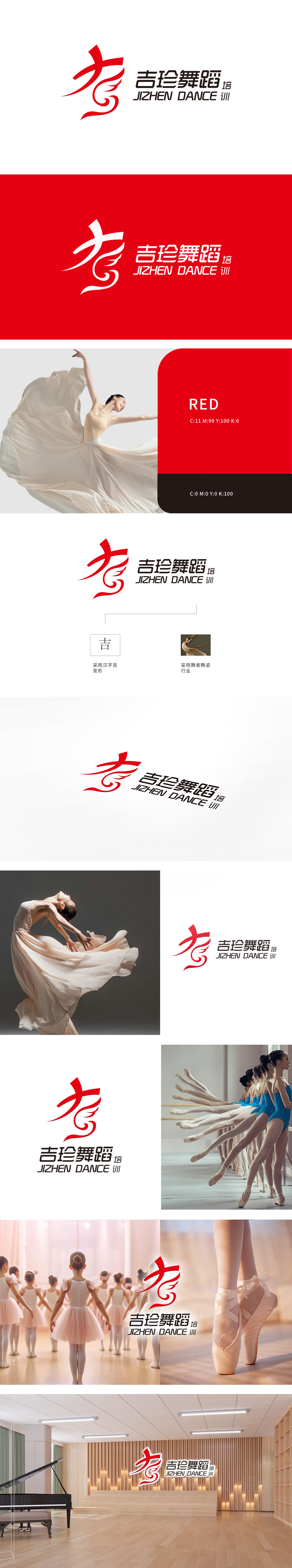
狮动为吉珍舞蹈培训设计logo,以红色动态线条勾勒舞者姿态,抽象而优雅,精准传达舞蹈的灵动与活力。中英文品牌名称简洁大气,红黑对比强化视觉冲击,右下角“培训”二字巧妙点睛。设计兼具艺术感与辨识度,完美融合品牌定位与国际视野,客户对狮动的创意能力赞不绝口,直呼“专业到位”!
Lion Dance designed the logo for Jizhen Dance Training, and outlined the dancer's posture with red dynamic lines, which was abstract and elegant and accurately conveyed the agility and vitality of the dance. The Chinese and English brand names are concise and atmospheric, the contrast between red and black enhances the visual impact, and the word "training" in the lower right corner is a clever finishing touch.


扫码或拨打添加客服微信


