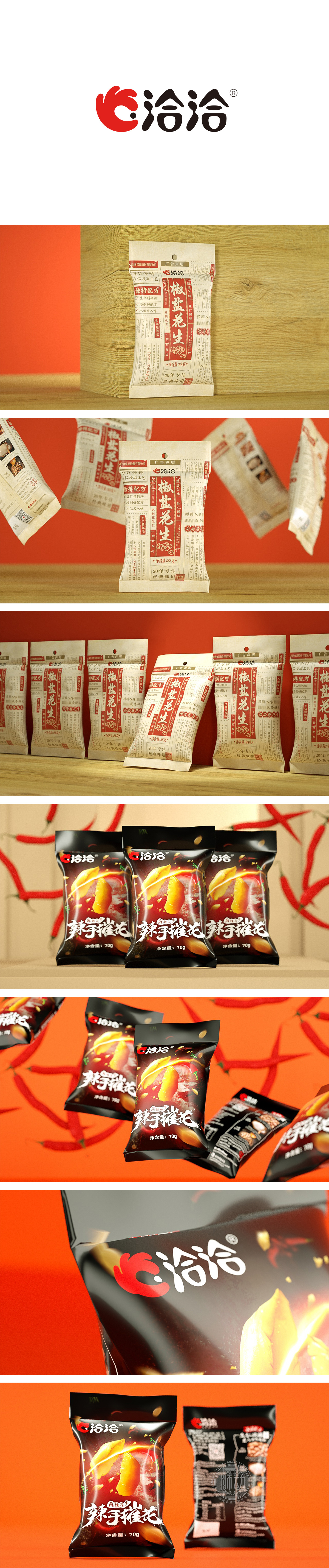
狮动设计以“旧报纸+牛皮纸”为核心视觉符号,直接指向“传统、可靠、有故事”的经典印象:外层采用仿牛皮纸的米白色底材,自带粗糙的肌理感,模拟老式食品包装的“朴素感”,传递“原生、天然”的产品属性;整体排版借鉴老报纸的竖列排版逻辑,文字以“分栏+小标题”的形式密集排列,搭配“花边边框”“印章式标语”,像一张“食品版老报纸”,瞬间唤醒消费者对“小时候吃的经典花生”的情感记忆。20年专注经典味道”→强化“几代人都吃的味道”,让消费者产生“这才是真正的椒盐花生”的认同感。用“经典符号+清晰信息+情感共鸣”,既突出了“传统工艺”的核心卖点,又通过复古设计唤醒了消费者的情感记忆,同时保持了信息的可读性与合规性。
Lion design takes "old newspaper+kraft paper" as the core visual symbol, which directly points to the classic impression of "tradition, reliability and story": the outer layer adopts beige substrate imitating kraft paper, which has a rough texture, simulates the "simplicity" of old-fashioned food packaging and conveys the "original and natural" product attributes; The overall typesetting draws lessons from the vertical typesetting logic of old newspapers. The characters are arranged in the form of "columns+subheadings" and matched with "lace borders" and "stamp slogans", like a "food old newspaper", which instantly awakens consumers' emotional memory of "classic peanuts eaten as children".


扫码或拨打添加客服微信


