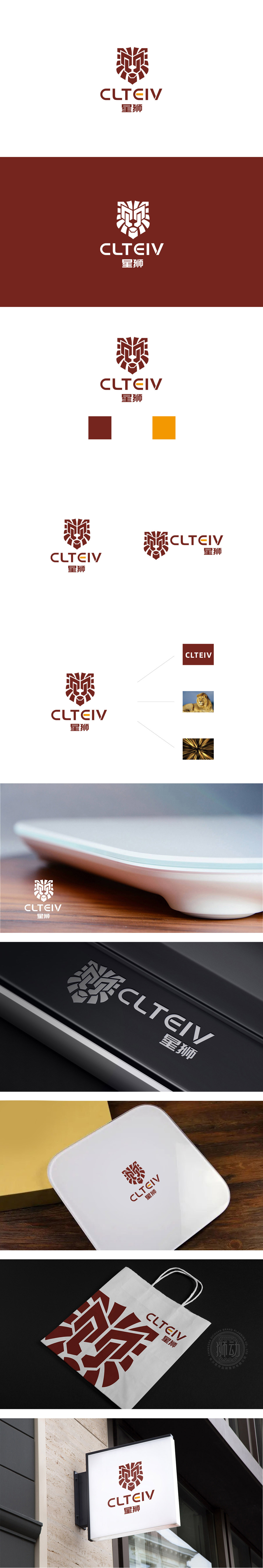
狮动设计通过极简的几何线条提炼狮子的关键特征,既保留了“狮”的力量感与辨识度,又避免了传统写实风格的厚重,更符合电子领域“现代、科技、高效”的视觉语言;英文“CLTEIV”采用无衬线字体,字形方正有力,其中字母“E”用黄色填充(与深棕色主色调形成对比),既打破了单调感,又成为视觉焦点;整体通过“抽象与写实的平衡”“传统与现代的融合,将“狮子”这一传统符号,成功转化为适合电子领域的品牌视觉资产。
Lion design refines the key features of the lion through minimalist geometric lines, which not only retains the sense of strength and recognition of the lion, but also avoids the massiness of the traditional realistic style, which is more in line with the visual language of "modern, scientific and efficient" in the electronic field. English "CLTEIV" adopts sans serif font, and its font is square and powerful, in which the letter "E" is filled with yellow (in contrast to the dark brown main color), which not only breaks the sense of monotony, but also becomes the visual focus; Through the balance of abstraction and realism and the integration of tradition and modernity.


扫码或拨打添加客服微信


