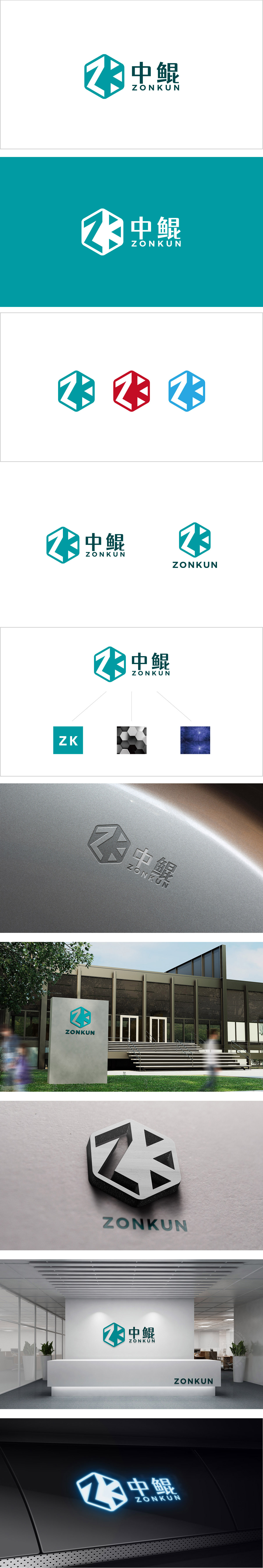
狮动设计以六边形为基础框架(象征稳固、理性、未来感),通过抽象的线条组合成“Z”+“K”的缩写,字母的辨识度高,颜色选择低饱和度的青绿色,传递“创新、活力、未来”的情感价值,让品牌不仅“好认”,还能“有温度”。用设计语言把“品牌”的本质“翻译”成了“能直接感知的视觉密码”。
Lion Design is based on a hexagon (symbolizing stability, rationality and futurity), and is combined into the abbreviation of "Z" and "K" through abstract lines. The letters are highly recognizable, and the color is turquoise with low saturation, which conveys the emotional value of "innovation, vitality and future" and makes the brand not only "easy to recognize" but also "warm". Translate the essence of "technology brand" into "visual code that can be directly.


扫码或拨打添加客服微信


