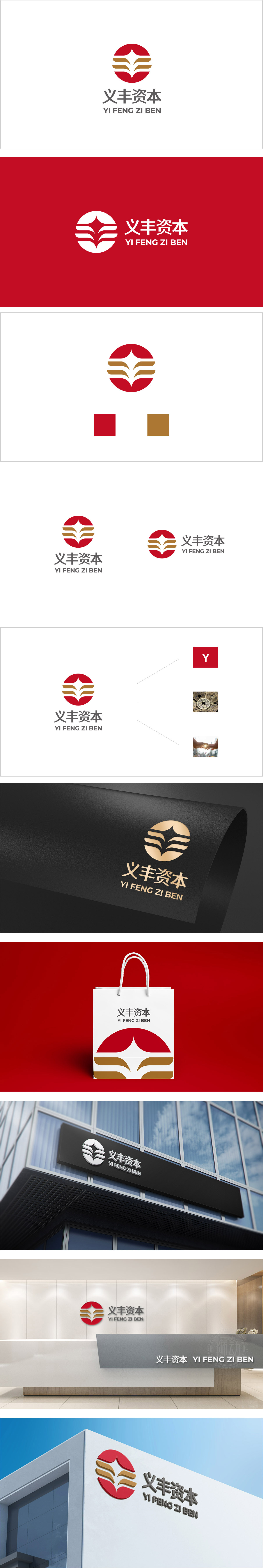
狮动设计采用正圆形为核心载体,在金融语境中,圆形象征完整、统一、稳健,符合资本公司需要传递的“可靠感”,色彩体系:用颜色“说金融语言”,logo的色彩搭配(红+金+白)完全贴合金融行业的“价值传递逻辑”:红色主体:在中国金融市场中,红色是“上涨、收益”的符号,直接关联“增长”与“积极回报”;金色曲线:金色是“财富、高端、价值”的代名词,三条金色曲线既像“资金流动的轨迹”,又像“向上的增长曲线”(暗示资产增值),精准传递“财富管理”的核心业务属性;整体通过“圆形(稳健)+ 红金(价值)+ 星形(指引)+ 曲线(增长)”的极简组合,精准传递了资本公司的“安全、专业、增长”三大核心价值,同时融入“义丰”的文化内涵,实现了“视觉辨识度”与“品牌逻辑”的高度统一。
Lion design takes the right circle as the core carrier. In the financial context, the circle symbolizes integrity, unity and stability, which conforms to the "sense of reliability" that capital companies need to convey. The color system: use color to "speak financial language", and the color matching of logo (red+gold+white) completely fits the "value transmission logic" of the financial industry: red subject: in China financial market, red is "rising". Golden Curve: Golden is synonymous with "wealth, high-end and value". The three golden curves are like "the track of capital flow" and "upward growth curve" (implying asset appreciation), which accurately convey the core business attributes of "wealth management"; As a whole, through the minimalist combination of "circle (stability)+red gold (value)+star (guidance)+curve (growth)".


扫码或拨打添加客服微信


