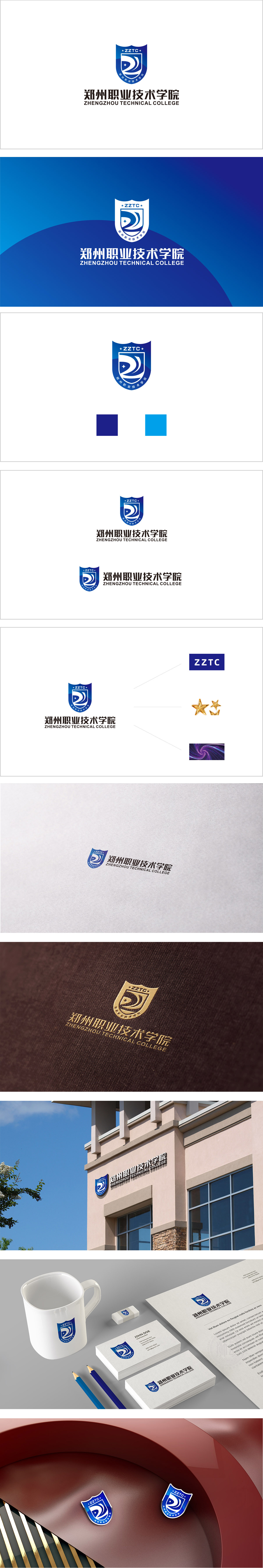
狮动设计采用以盾牌为基础轮廓,这一经典形态的核心语义是“可靠、守护、传承”,“Z”的变形:地域与身份的标识,图形主体是“郑州”首字母“Z”的抽象化,通过重叠的波浪轮廓强化“动感”,既点明学院的地域属性(扎根郑州),又象征职业教育的动态发展(紧跟产业需求,不断创新)。波浪:地域与产业的联结.波浪的“流动感”进一步延伸为产业融合的隐喻——职业技术学院的核心是“产教结合”,如同波浪推动河流前进,学院推动学生融入产业、服务地方经济。星星:教育的“希望属性”,也暗示教育是“点亮人生”的过程。整体通过盾牌(稳重)+ 抽象“Z”(地域)+ 波浪(产业)+ 星星(希望)的组合,完美传递了“扎根郑州、专注职业、培养希望”的学院形象。
Lion design adopts the outline based on shield, and the core semantics of this classic form are "reliability, protection and inheritance", and the deformation of "Z": the identification of region and identity.The graphic subject is the abstraction of the initial "Z" of "Zhengzhou", which strengthens the "dynamic" through overlapping wave contours, which not only points out the regional attribute of the college (rooted in Zhengzhou), but also symbolizes the dynamic development of vocational education (keeping up with industrial demand and constantly innovating). Wave: the connection between region and industryThe "sense of mobility" of waves further extends to the metaphor of industrial integration-the core of vocational and technical colleges is "combination of production.


扫码或拨打添加客服微信


