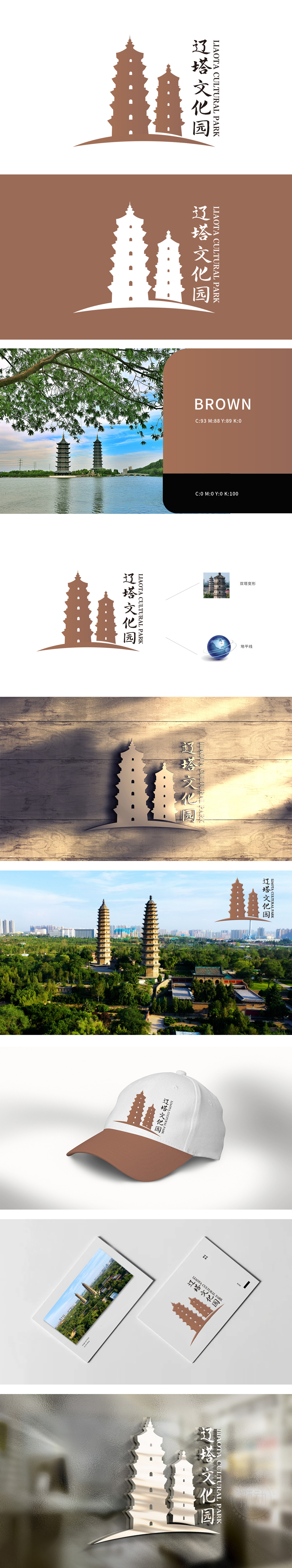
狮动设计以双塔为元素,寓意深厚文化底蕴,中式风格彰显独特韵味。在文旅行业蓬勃发展当下,该logo展现文化传承与创新。从品牌故事看,仿佛诉说辽塔历经岁月的辉煌。狮动通过此设计,展现超强设计力,精准把握文化内涵与视觉美感,为文旅品牌打造极具辨识度标识,助客户打造独特品牌形象。
The Lion Movement team conducted in-depth research on the industry trends and brand concepts, with vibrant orange as the main color, created an embarrassing cartoon bear image, and held a spoon to convey the pleasure of dining. Innovative use of "auspicious | food | bear" separate design, with pinyin to strengthen recognition. Simple and bright visual language fits the light food track accurately, and customers are full of praise for the design .


扫码或拨打添加客服微信


