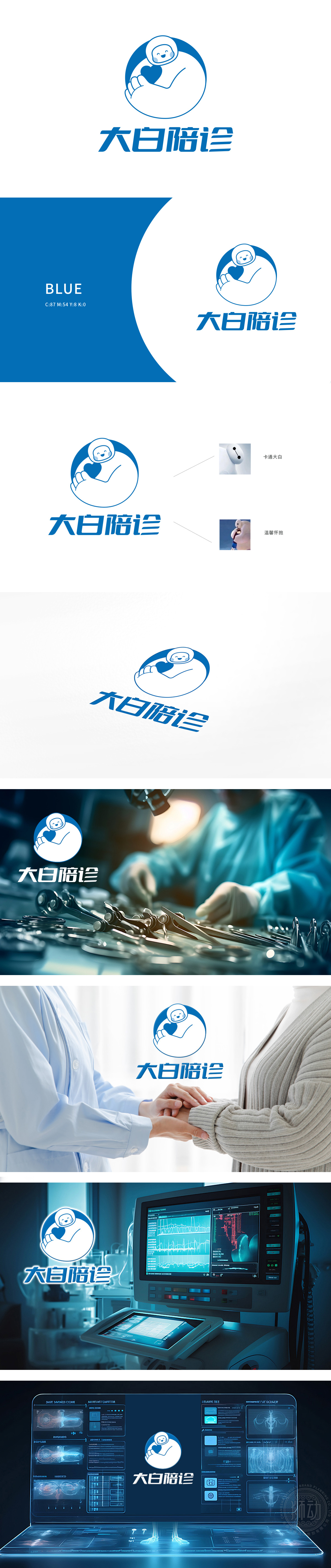
狮动团队以一个可爱的卡通形象(类似大白)怀抱着一颗心,整体设计简洁温馨,传达出温暖和关怀的服务理念。图形寓意着公司在医疗服务中注重品质与客户体验,致力于提供贴心、专业的陪诊服务。客户认可是公司追求的金字招牌,这一设计不仅展现了狮动的设计能力,也成功吸引了新客户对品牌温暖医疗服务的认可与欣赏。
The Lion Movement team conducted in-depth research on the industry trends and brand concepts, with vibrant orange as the main color, created an embarrassing cartoon bear image, and held a spoon to convey the pleasure of dining. Innovative use of "auspicious | food | bear" separate design, with pinyin to strengthen recognition. Simple and bright visual language fits the light food track accurately, and customers are full of praise for the design ability of Lion Motion's "strategy+creativity" dual drive, calling "this is the soul of our new brand"!


扫码或拨打添加客服微信


