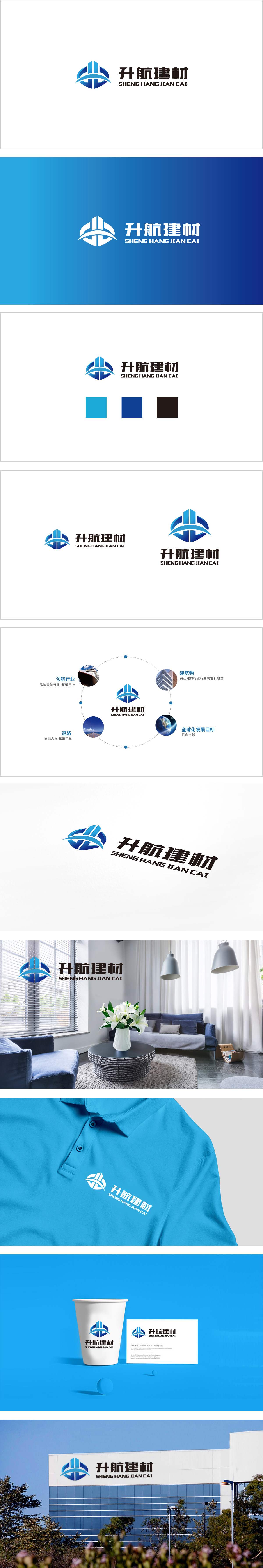
狮动设计采用“品牌名称→视觉符号→理念传递”的闭环:“升”:图形中的“竖条”(高楼上升)、“横弧线”(上升轨迹),传递“提升、成长”的企业愿景;“航”:两侧的“翅膀弧形”(飞翔)、“字体中的‘舟’旁”(航行),呼应“航行、前进”的品牌名称;“建材”:中间的“高楼符号”(建筑)、“蓝色系”(专业),直接关联行业属性。整体造型:图形呈对称结构,传递“稳定、可靠”的感觉,用最少的视觉元素,传递最准确的品牌信息。
Lion Design adopts the closed loop of "brand name → visual symbol → concept transmission": "Ascension": the vertical bar (the rising of a tall building) and the horizontal arc (the rising trajectory) in the figure, which convey the corporate vision of "promotion and growth"; "Navigation": the "wing arc" (flying) and "beside the boat in the font" (sailing) on both sides echo the brand name of "sailing and advancing"; "Building materials": the middle "symbol of tall building" (architecture) and "blue department" (specialty) are directly related to the industry attributes. Overall modeling.


扫码或拨打添加客服微信


