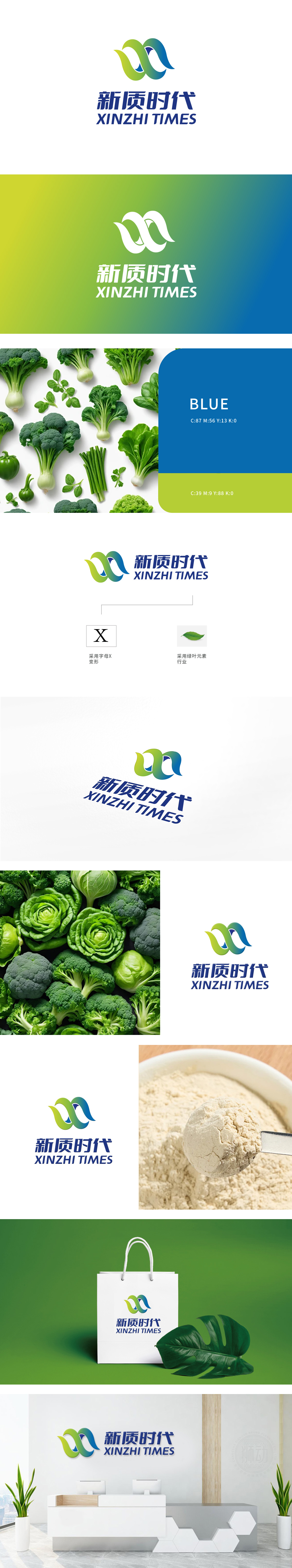
狮动设计以“新质时代”为核心理念。标志采用交织弧形设计,象征自然生长与循环,渐变绿至蓝色寓意从土地到海洋的生态链,呼应有机食品行业的可持续本质。字体简洁现代,传递创新与活力,既展现专业可靠,又彰显活力高效,让人眼前一亮。
Lion design takes "new quality era" as its core concept. The logo is designed in an interlaced arc, symbolizing natural growth and circulation. The gradual change from green to blue symbolizes the ecological chain from land to sea, echoing the sustainable nature of the organic food industry. The font is concise and modern, conveying innovation and vitality.


扫码或拨打添加客服微信


