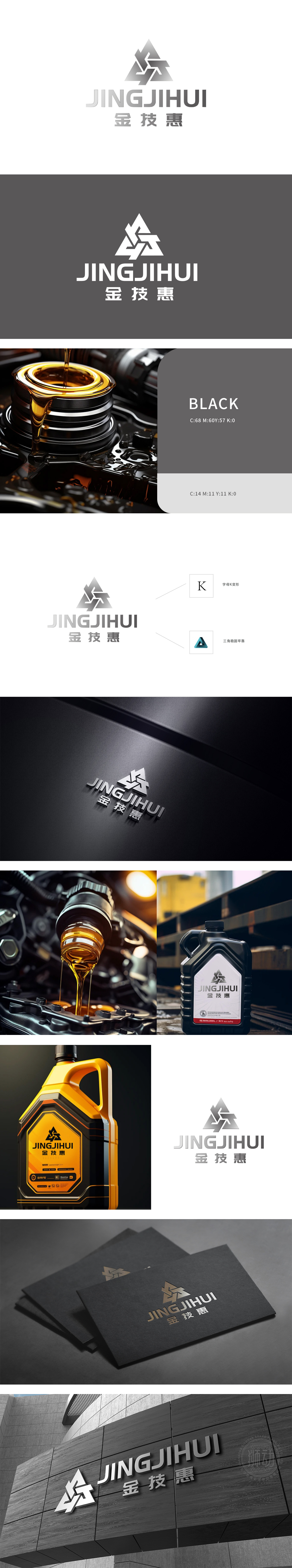
狮动设计通过深入行业调研与创意提炼,将产品特性转化为极具辨识度的视觉符号。本案从机油的润滑核心功能、工业应用场景出发,用简约而富有力量感的造型语言,精准传递品牌「专业·可靠·高效」的价值主张。以坚韧的三角形元素构建立体标志,象征机油润滑油的稳定性、机械力量与工业质感。灰色渐变赋予科技感与专业信赖,契合化工行业的严谨与高效。品牌价值传递,视觉记忆点:几何线条交织形成动态张力,暗喻机油在机械运转中的核心润滑作用,瞬间抓住行业核心特质。
We deeply cultivate brand visual design in the field of chemical energy, and transform product characteristics into highly recognizable visual symbols through in-depth industry research and creative refining. Starting from the lubricating core function and industrial application scene of engine oil, this case accurately conveys the brand's value proposition of "professionalism, reliability and efficiency" with simple and powerful modeling language. The three-dimensional symbol is constructed with tough triangular elements, which symbolizes the stability, mechanical strength and industrial texture of engine oil and lubricating oil.


扫码或拨打添加客服微信


