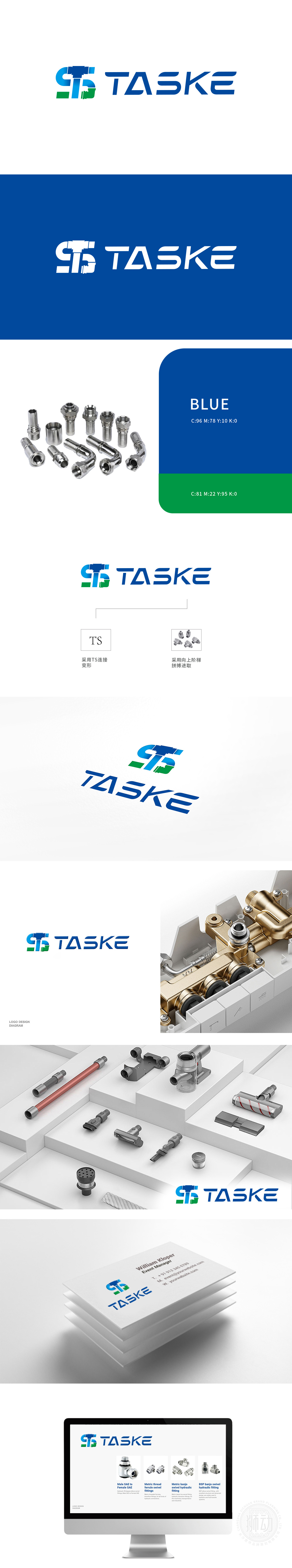
狮动设计抓住五金行业的核心属性——坚固、精密与创新。创作中,以蓝绿几何图形为核心,通过动态弧形与锐利线条构建视觉张力,既象征机械零件的精密咬合,又暗含品牌“锐意突破”的精神。色彩上,蓝绿搭配既呼应环保理念,又传递专业与信赖感。客户在初稿阶段便惊叹于设计的战略性与美感:“这图形像一把拧紧的扳手,牢牢抓住我们行业的灵魂!”
Lion design grasps the core attributes of hardware industry-firmness, precision and innovation.In the creation, the blue-green geometric figure is the core, and the visual tension is constructed through dynamic arcs and sharp lines, which not only symbolizes the precise occlusion of mechanical parts, but also implies the spirit of "breaking through" of the brand. In color, the combination of blue and green not only echoes the concept of environmental protection, but also conveys professionalism and trust. At the first draft stage, customers were amazed at the strategic and aesthetic feeling of the design: "This figure is like a tightened wrench, firmly grasping the soul of our industry!"


扫码或拨打添加客服微信


