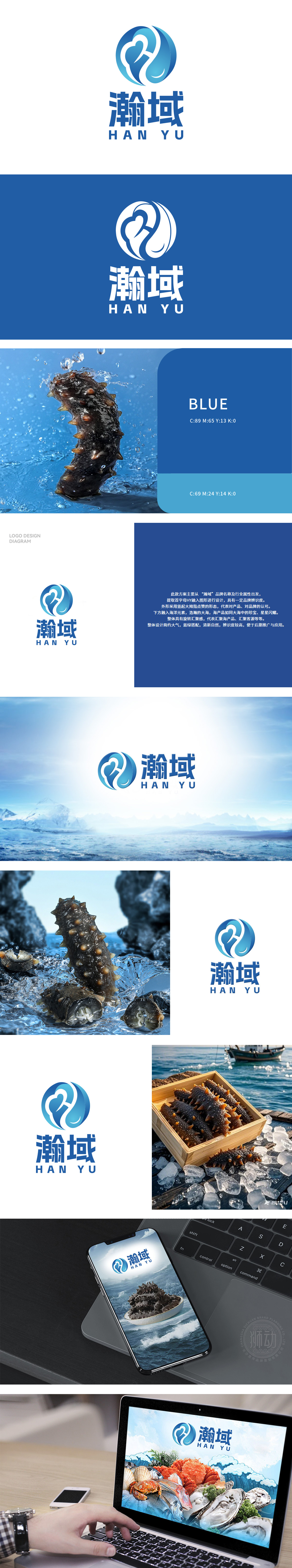
狮动展现出卓越设计能力,图形以水为灵感,代表海鲜生长的海洋环境,灵动曲线蕴含活力,似海鲜跃动。同时体现海鲜新鲜与品质。客户选择此方案,因它完美契合海鲜的海洋环境,通过造型传递出海鲜鲜嫩口感,寓意品牌如海洋般广阔,助力公司在市场中脱颖而出。
The Lion Movement team conducted in-depth research on the industry trends and brand concepts, with vibrant orange as the main color, created an embarrassing cartoon bear image, and held a spoon to convey the pleasure of dining. Innovative use of "auspicious | food | bear" separate design, with pinyin to strengthen recognition. Simple and bright visual language fits the light food track accurately, and customers are full of praise for the design .


扫码或拨打添加客服微信


