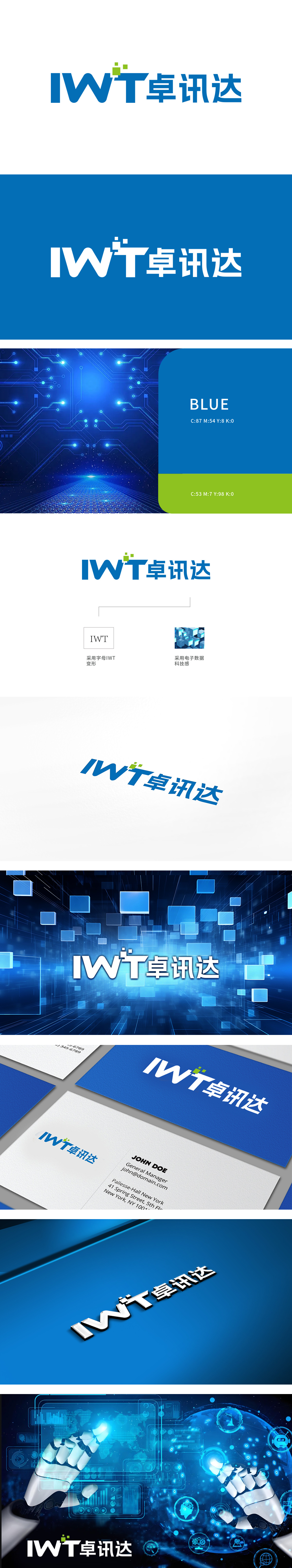
狮动受公司委托设计logo,方案以“IWT卓讯达”为核心,字母与右侧中文浑然一体。设计师巧妙将三色方块融入IWT右上角,象征科技层叠与创新跃升,蓝绿配色传递专业与活力。创作意图紧扣企业“卓越通讯,达至未来”的理念,图形简洁而寓意深远。客户因其精准契合品牌定位,兼具辨识度与象征意义,展现了狮动设计创新力。
Lion Motion was commissioned by the company to design the logo. The scheme takes "IWT Zhuoxunda" as the core, and the letters are integrated with the Chinese on the right. The designer skillfully integrates the three-color box into the upper right corner of IWT, symbolizing the technological cascade and innovation leap, and the blue-green color scheme conveys professionalism and vitality. The creative intention is closely related to the enterprise's concept of "excellent communication, reaching the future", and the graphics are concise and profound.


扫码或拨打添加客服微信


