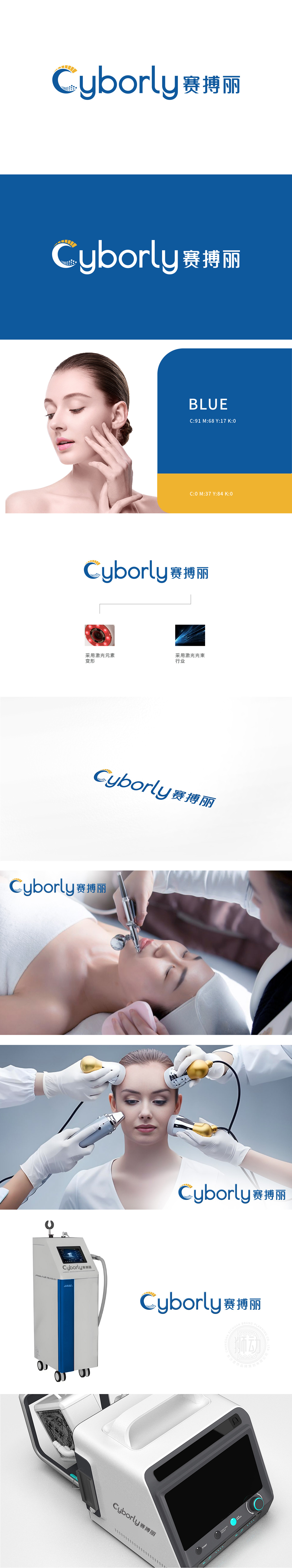
狮动设计的LOGO方案以字母“C”为基底,融合太阳光芒与蓝色水滴元素,象征活力、科技与自然的共生。设计团队精准捕捉行业特性,通过动态线条展现专业护理带来的焕新体验。客户认可该方案因独特视觉符号直观传达品牌“科学养护肌肤”的核心理念,色彩搭配既彰显科技感又不失温和质感,最终方案完美契合品牌定位与市场诉求。
The LOGO scheme designed by Lion Motion is based on the letter "C", which combines the sun's rays and blue water droplets, symbolizing the symbiosis of vitality, technology and nature. The design team accurately captures the characteristics of the industry and shows the refreshing experience brought by professional nursing through dynamic lines. Customers recognize that this scheme intuitively conveys the core concept of "scientific skin care" of the brand because of its unique visual symbols, and the color matching not only shows the sense of science and technology.


扫码或拨打添加客服微信


