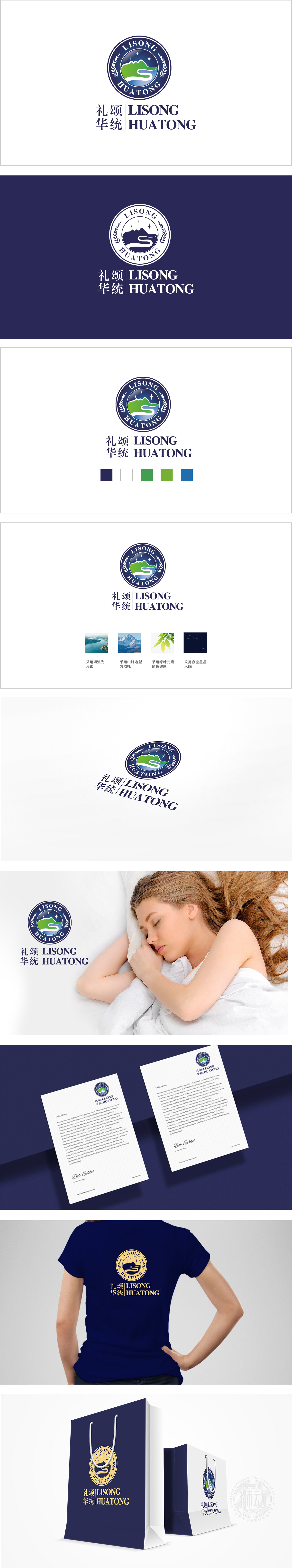
狮动设计以“核心图形+环绕文字”的布局,形成“内紧外松”的视觉节奏:核心图形(山、水、星星)作为视觉焦点,绿色山体:绿色是健康、自然、有机的代名词,山的形态稳定、坚实,暗示产品“天然来源,蓝色水域+白色波浪:水是生命之源,蓝色象征纯净、清澈,白色波浪则代表活力、循环,两颗星星,暗示产品“卓越品质”或“行业中的亮眼表现”;月桂叶是“胜利、成就、品质”的象征,好的保健品设计,根本不用说话,视觉会直接“撞”进你对“健康”的想象里。这才是设计的“冲击力”:不用解释,直接共鸣。。
Lion Design takes the layout of "core graphics+surrounding characters" to form a visual rhythm of "tight inside and loose outside": the core graphics (mountains, water and stars) are the visual focus, green mountains: green is synonymous with health, nature and organic, and the shape of mountains is stable and solid, suggesting that products are "natural sources, blue waters+white waves: water is the source of life, and blue symbolizes purity. Laurel leaf is a symbol of "victory, achievement and quality". Good health care product design needs no words at all, and vision will directly "bump" into your imagination of "health". This is the "impact" of design: direct resonance without explanation.


扫码或拨打添加客服微信


