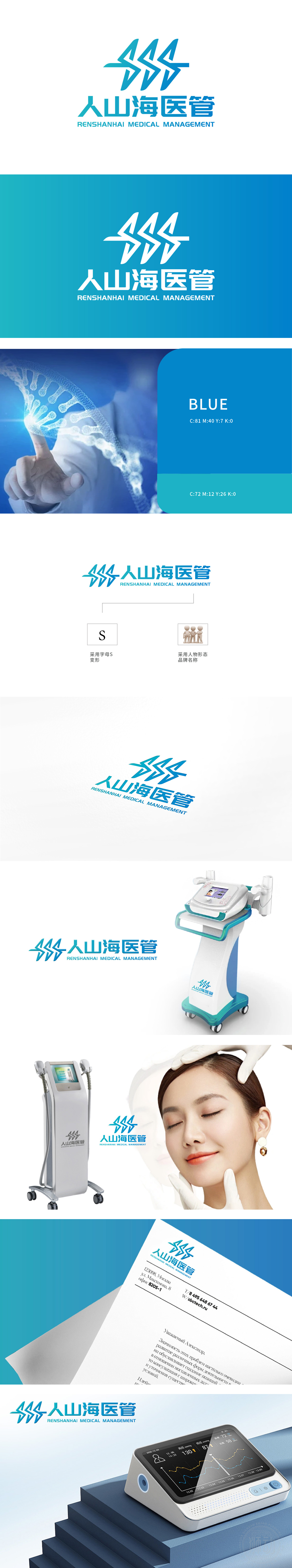
狮动设计图形设计独特,形似“人”字与医疗符号的结合,寓意以人为本的医疗服务理念,传达了公司致力于提供高质量医疗服务的宗旨。采用蓝色调,符合医疗行业的专业和信任感。Logo适用于医疗器械的包装、宣传资料,传递专业和可靠的形象。
The graphic design of Lion Motion is unique, which looks like the combination of the word "human" and medical symbols, implying the people-oriented medical service concept and conveying the company's purpose of providing high-quality medical services. Adopt blue tone, in line with the professionalism and trust of the medical industry. Logo is suitable for packaging and publicity materials of medical devices, and conveys a professional and reliable image.


扫码或拨打添加客服微信


