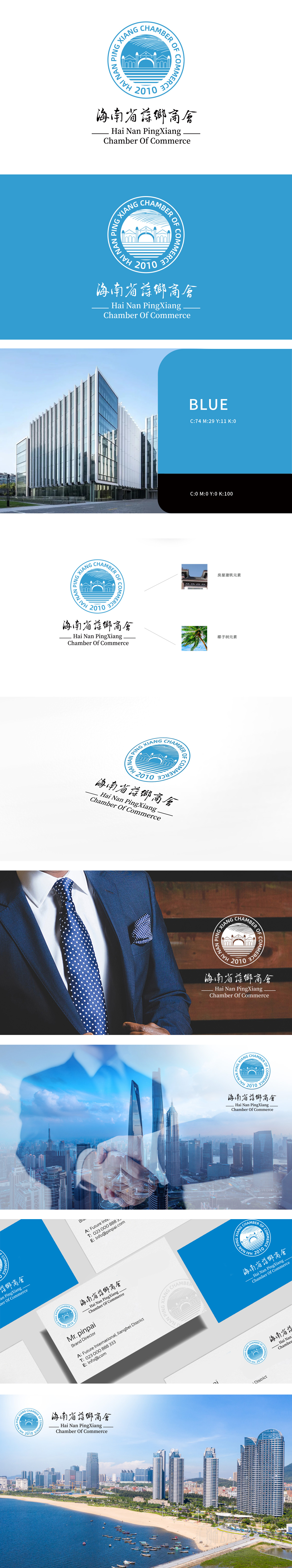
狮动设计将Logo中央展示了一座桥梁和建筑物的轮廓,背景为波浪形图案,象征着海洋和桥梁连接的意象。寓意商会作为企业和政府之间的桥梁作用。颜色主要采用蓝色,传达出海洋、信任和稳定的感觉地域特色,波浪图案明显体现了海南作为海岛省份的地域特色。独特的图形和文字组合,使Logo具有较高的辨识度,便于推广和记忆。
Lion design shows the outline of a bridge and a building in the center of the Logo, with a wavy background, which symbolizes the image of the connection between the ocean and the bridge. It means that the Chamber of Commerce acts as a bridge between enterprises and the government. The color is mainly blue, which conveys the regional characteristics of ocean, trust and stability, and the wave pattern clearly reflects the regional characteristics of Hainan as an island province.


扫码或拨打添加客服微信


