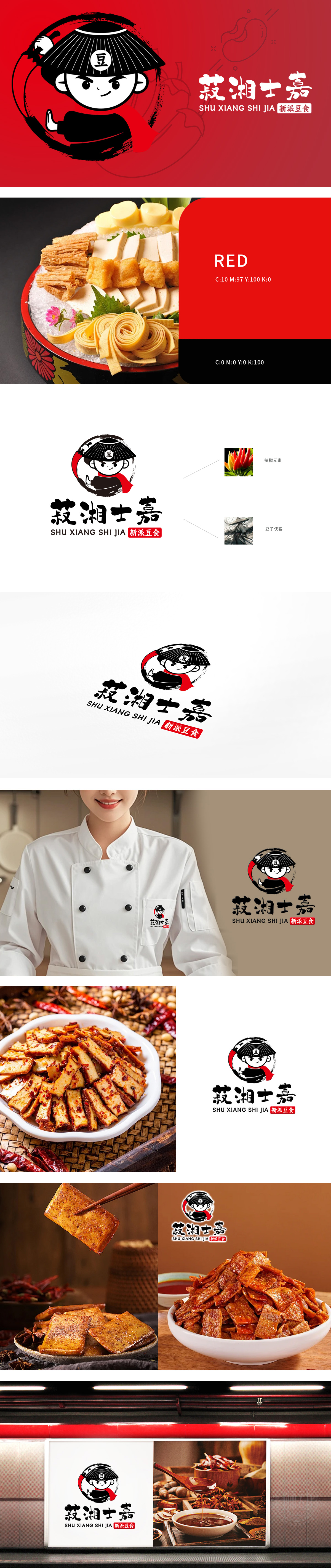
狮动在此logo设计中。 将传统文化元素与现代审美精准结合。线条简洁流畅,黑、红、白三色搭配经典又醒目,既保留传统韵味,又符合当下新派潮流。“菽”为豆类古称,点明豆食根本。想象在湖湘大地,有一群对豆食满怀热忱的“士”(代表专业与匠心之人),秉持着对传统豆食的传承与创新之志,打造出“新派豆食”(美好之意)。他们传承古老豆食工艺,融入现代创新理念与食材搭配,就如同这logo中传统与现代元素的完美融合,为食客带来别具一格的豆食体验,开启一场从传统走向新潮的美味之旅。狮动用logo为这个充满故事与情怀的品牌,勾勒出了极具吸引力的开篇,也让新客户更能感受到品牌背后的文化底蕴与发展潜力。
Lion moves in this logo design. Combine traditional cultural elements with modern aesthetic precision. The lines are simple and smooth, and the combination of black, red and white is classic and eye-catching, which not only retains the traditional charm, but also conforms to the current new trend. "Bitter" is an ancient name for beans, which points out that bean food is fundamental. Imagine that in the land of Huxiang, there are a group of "scholars" who are full of enthusiasm for bean food (representing professionals and ingenuity), adhering to the inheritance and innovation of traditional bean food and creating a "new school of bean food" (beautiful meaning).


扫码或拨打添加客服微信


