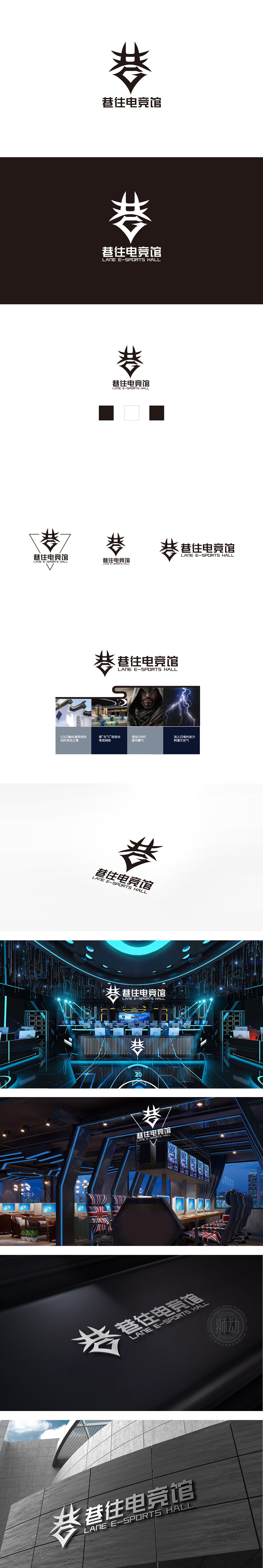
狮动设计通过极简线条将文字符号化,既保留了品牌名称的辨识度,又赋予了图形的视觉冲击力:“巷”的温度:叠檐结构模拟“巷弄”的层级感,让人联想到“邻里相聚”的温暖——电竞馆不是冰冷的竞技场所,而是“像巷弄一样有烟火气的青年社区”。“往”的动力:箭头形态像“向下扎根的根须”,又像“向上突破的剑”,传递“立足当下、展望未来”的电竞精神。“聚集”的内核:结合整体的“倒梯形”(像“开放的门”),暗示“电竞馆是欢迎所有年轻人的‘包容空间’”。整体既保留了“巷往”的独特性,又通过设计传递了“年轻、热血、包容”的品牌形象。
Lion design symbolized the characters by minimalist lines, which not only retained the recognition of the brand name, but also gave the graphics visual impact: the temperature of the alley; the overlapping eaves structure simulated the hierarchical sense of the alley, which reminded people of the warmth of "neighborhood gathering"-the e-sports hall was not a cold competitive place, but a "youth community with fireworks like the alley". Motive force of "going": The arrow is shaped like a "root that takes root downwards" and a "sword that breaks through upwards", conveying the e-sports spirit of "basing on the present and looking forward to the future". The core of "gathering".


扫码或拨打添加客服微信


