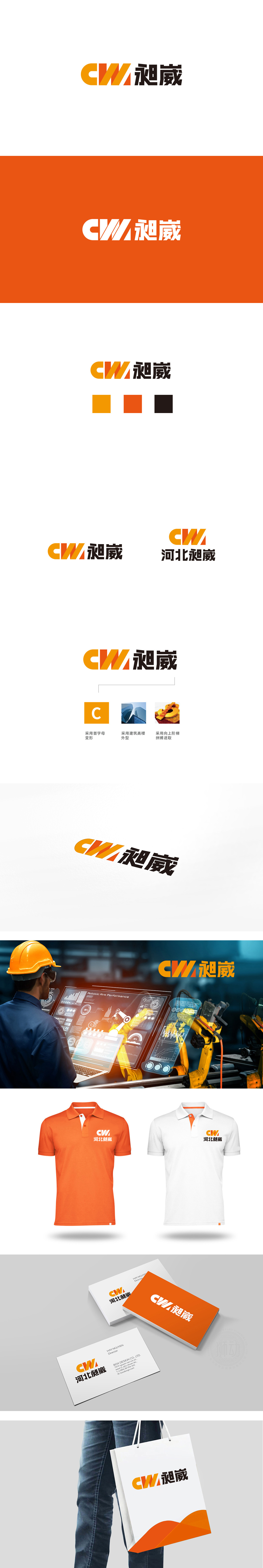
狮动设计采用品牌首字母“C”“W”为核心,通过几何化变形形成视觉主体,“C”简化为左侧的橙色大弧线,圆润的轮廓传递亲和感;“W”则拆解为右侧的两个斜切橙色块,线条锋利且呈向上倾斜的角度,形成“阶梯”或“高楼”的视觉联想;图形整体呈左圆右锐的结构,既有“包容”(C的圆润),又有“突破”(W的斜切),平衡感极佳。橙色(暖色调),传递活力、积极、专业的感觉,符合现代企业“年轻化、有冲劲”的形象,整体以“品牌符号”为核心,通过“首字母变形”强化记忆,“建筑外型”关联行业,“向上阶梯”传递稳重、可靠的品牌形象。
Lion esign takes the brand initials "C" and "W" as the core, and forms the visual subject through geometric deformation. "C" is simplified to the orange arc on the left, and the rounded outline conveys the sense of affinity."W" is disassembled into two oblique orange blocks on the right, with sharp lines and an upward inclined angle, forming a visual association of "ladder" or "tall building"; As a whole, the figure shows a sharp structure, which is both "inclusive" (the roundness of C) and "breakthrough" (the oblique cutting of W), and has an excellent sense of balance.Orange (warm color) conveys a sense of vitality, positivity and professionalism, which conforms to the image of "young and aggressive" of modern enterprises.


扫码或拨打添加客服微信


