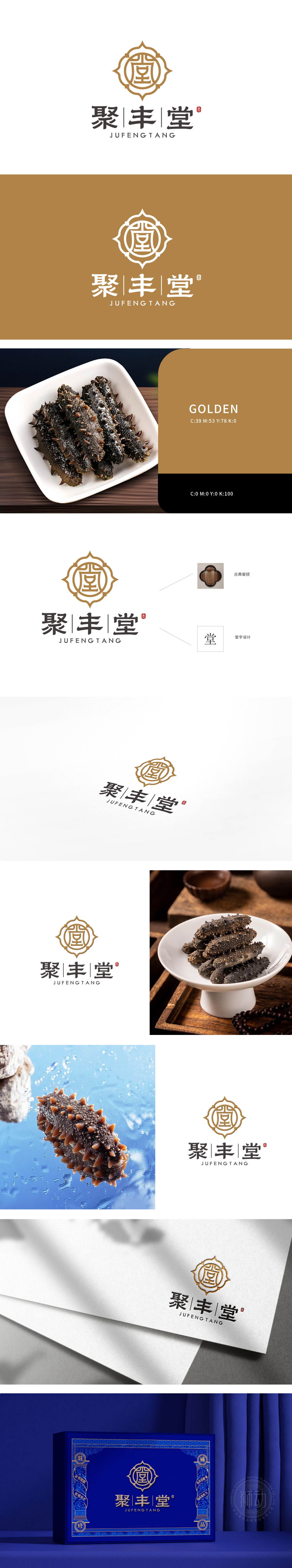
狮动设计整体以金色为主色调,传递出高贵、典雅之感。中心的“堂”字设计独具匠心,融入中式传统元素,外圈花纹如绽放的花瓣,寓意多元与包容,又似中式窗棂,增添古朴韵味,同时又似一只海参舒展的触角,展现出海参品牌,字体造型端庄稳重。这种设计兼具传统底蕴与现代美感,品牌辨识度高。
The lion's design is dominated by gold, which conveys a sense of nobility and elegance. The design of the word "Tang" in the center is unique, incorporating Chinese traditional elements. The outer ring pattern, such as blooming petals, symbolizes diversity and tolerance, and it is like a Chinese window lattice, adding quaint charm. At the same time, it is like a sea cucumber stretching tentacles, showing the sea cucumber brand, and the font shape is dignified and steady.


扫码或拨打添加客服微信


