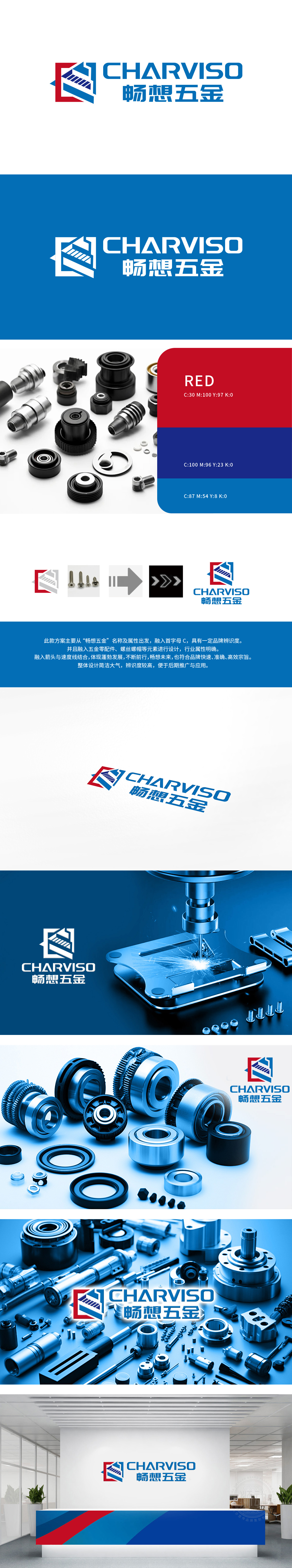
狮动设计以几何力学为灵感,红色与蓝色碰撞构建稳固的“C”字形主体,象征螺丝螺帽的咬合力量与机械结构的精密性,直观传递重工行业所需的“稳定性”与“专业度”。斜向线条纹理」内部线条如螺旋延伸,暗喻螺丝旋转的动态势能,既打破僵硬感,又呼应五金部件的“连接”与“传动”功能,让静止的logo焕发工业活力 「蓝红配色哲学」:蓝色锚定科技信赖感,红色注入动力与警示(契合机械安全属性),色彩心理学与行业特性完美融合,一眼建立专业印象。让logo不仅是标识,更是“可靠制造”与“高效传动”的行业承诺;
Inspired by geometric mechanics, Lion Motion Design constructs a solid "C"-shaped main body by the collision of red and blue, which symbolizes the meshing strength of screws and nuts and the precision of mechanical structure, and intuitively conveys the "stability" and "professionalism" required by heavy industry. The internal lines of oblique line texture extend like a spiral, which implies the dynamic potential energy of screw rotation. It not only breaks the sense of rigidity, but also echoes the functions of "connection" and "transmission" of hardware parts.


扫码或拨打添加客服微信


