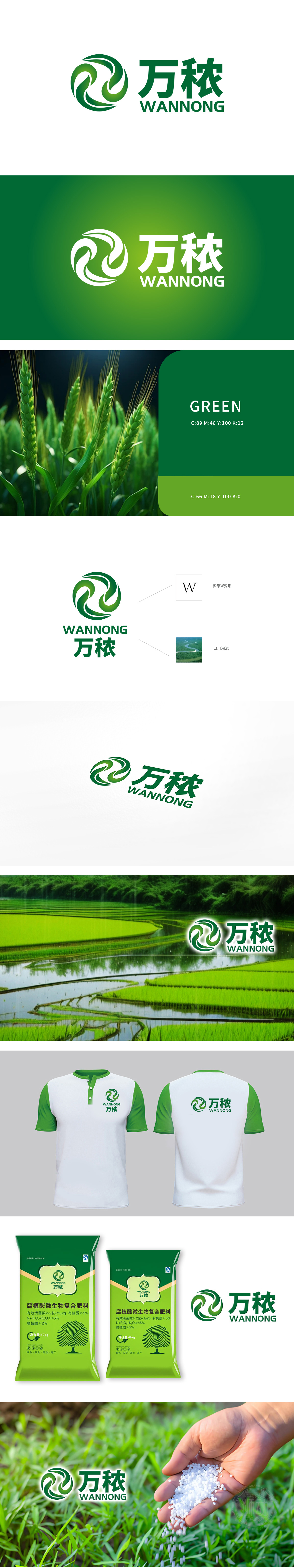
狮动设计以LOGO整体以动态旋转的抽象图形为核心,占据画面左上方视觉焦点,彰显品牌“万秾”的活力与生命力。绿色主色调传递自然、生态、可持续发展的理念,与农业/生态相关行业属性高度契合。多重形态:变形后的“W”如波浪、山脉或涌动的人流,暗含品牌多元业务维度或包容性。 弧形交织形成逆时针旋转趋势,暗示品牌创新突破的动能与行业引领者的姿态,以三个核心元素(变形W、山川、河流)浓缩品牌复杂信息,体现狮动“以简驭繁”的设计哲学。
Lion design takes the LOGO as a whole and the abstract graphics that rotate dynamically as the core, occupying the visual focus at the top left of the screen, and showing the vitality and vitality of the brand "Wan Wan". The green main color conveys the concept of nature, ecology and sustainable development, which is highly compatible with the attributes of agriculture/ecology-related industries. Multi-form: the deformed "W" is like waves, mountains or surging people, which implies the diversified business dimensions or inclusiveness of the brand.


扫码或拨打添加客服微信


