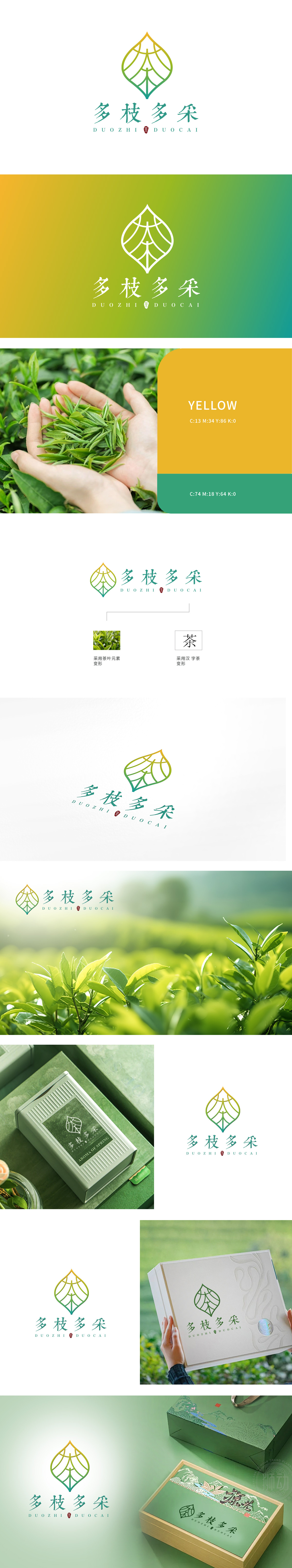
狮动采用茶叶元素变形设计,图标呈叶状,象征自然与精致。字体纤细绵长清新流畅,传达自然与活力。使用绿色和黄色渐变,象征自然、健康与生机。设计紧扣茶行业特性,新中式字体风格、笔画形态别致、高级感、流畅舒展,展现专业设计能力。清新色彩与简洁布局,吸引客户目光,提升品牌好感度,打造了一个极具辨识度与感染力的品牌标识,充分展现其非凡的设计实力。
The lion movement adopts the deformation design of tea elements, and the icon is leaf-shaped, symbolizing nature and exquisiteness. The font is slender, long, fresh and smooth, conveying nature and vitality. Use green and yellow gradients to symbolize nature, health and vitality. The design closely follows the characteristics of tea industry and shows professional design ability. Fresh colors and simple layout attract customers' attention and enhance brand goodwill.


扫码或拨打添加客服微信


