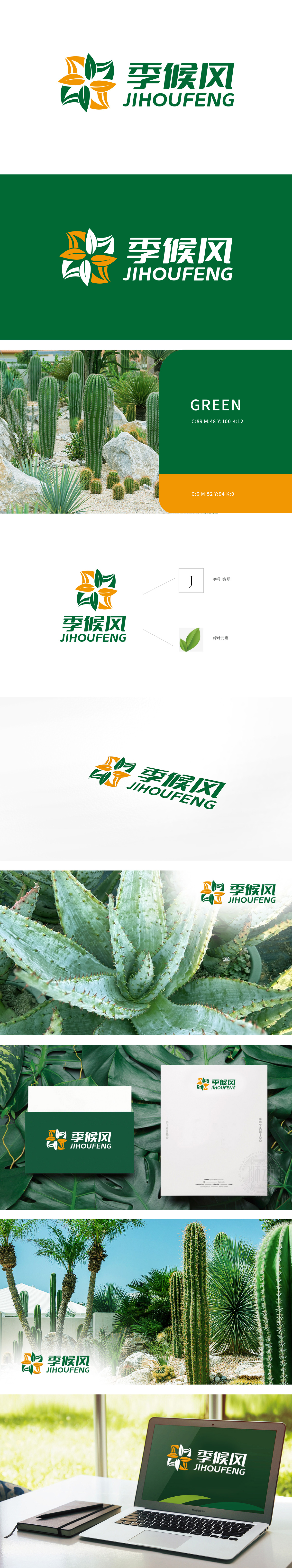
狮动设计以花瓣形状巧妙地融入了字母“J”的变形设计,象征公司名称的首字母,具有独特的品牌标识性。绿叶元素传达了自然、环保和生机勃勃的品牌理念,吸引注重环保和自然的客户群体。通过“J”字母和绿叶的结合,不仅强化了品牌记忆点,还传递出公司与自然环境和谐共生的价值观,该Logo设计不仅美观且富有深意,能够有效吸引新客户欣赏狮动的设计,同时传递出季候风公司的品牌理念。
Lion design skillfully incorporates the deformation design of the letter "J" in the shape of petals, which symbolizes the initials of the company name and has a unique brand identity. Green leaf elements convey the brand concept of nature, environmental protection and vitality, and attract customers who pay attention to environmental protection and nature. Through the combination of "J" letters and green leaves, it not only strengthens the brand memory.


扫码或拨打添加客服微信


