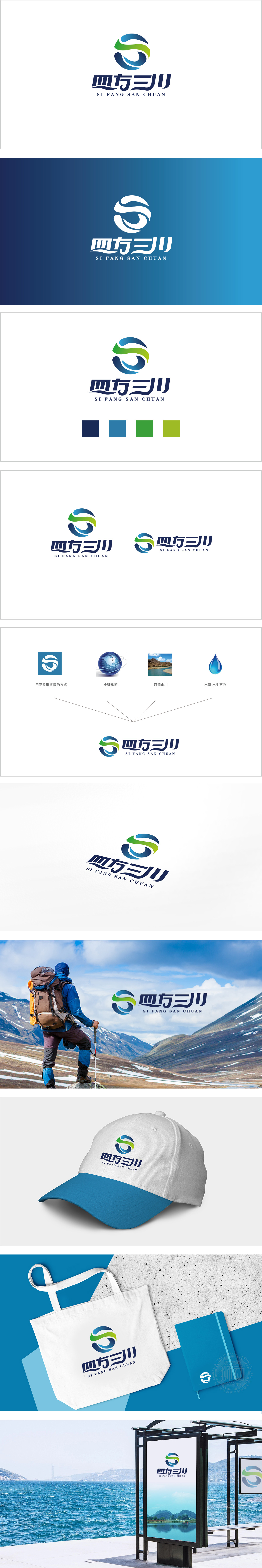
狮动设计用极简的曲线/留白构成抽象的“S”形,既暗示品牌名称中的“三川”(河流)流动感,也为图形设计奠定了**“简洁、现代、富有韵律”**的视觉基础。地球元系,直接关联“四方”的“四面八方、全球范围”,呼应“四方”的地域广度。 蓝(水)与绿(山)的渐变曲线,既保留了左侧“正负形拼接”的抽象感,又具象化了“河流山川”的自然意象——曲线似流动的河水,也似起伏的山峦,将“三川”的核心视觉化。同时,曲线的“流动感”也暗示旅游的“动态体验”(如行走、漂流等)。整体既符合旅游行业的“自然感”,又传递出“专业、可靠”的品牌形象。
Lion Design uses minimalist curves/blank spaces to form an abstract "S" shape, which not only implies the sense of "three rivers" (rivers) in the brand name, but also lays a visual foundation for graphic design. The earth element system is directly related to the "all directions and global scope" of the "quartet" and echoes the geographical breadth of the "quartet". The gradual curve of blue (water) and green (mountain) not only retains the abstract sense of "positive and negative stitching" on the left side, but also visualizes the natural image of "rivers and mountains"-the curve is like flowing rivers and undulating mountains, which visualizes the core of "Sanchuan".


扫码或拨打添加客服微信


