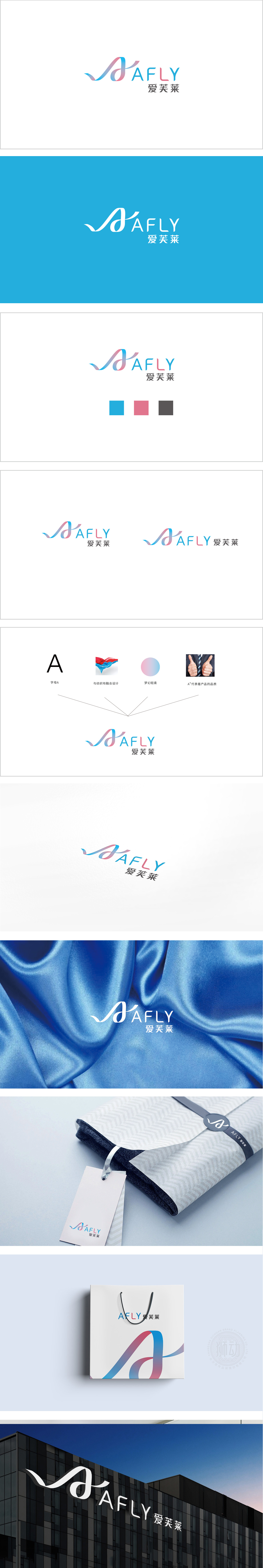
狮动设计采用字母"A":作为品牌的"视觉锚点",既是英文"AFLY"的首字母,也是中文"爱芙莱"的发音起点("A"→"爱"的谐音),同时承载了"产品品质核心"的价值,A"字母被设计成流动的"布料曲线",将"纺织品的柔软质感"转化为视觉符号,强化"材质亲肤"的感知。梦幻轻柔色既保留了"梦幻"的少女感,又通过蓝色增加了"清爽、可靠"的属性,完美呼应"轻柔"的产品体验。每一处细节都在强化"柔软、品质、亲和"的品牌形象。"AFLY"采用了"曲线+渐变+组合字体"**的设计,传递"轻盈、舒适、有温度"的品牌情绪。
Lion esign adopts the letter "A": as the "visual anchor" of the brand, it is not only the initial letter of English "AFLY", but also the pronunciation starting point of Chinese "Aifulai" (the homonym of "A"→" Love "), and at the same time carries the value of" product quality core ".The letter" A "is designed as a flowing" cloth curve ",which will" textile "The dreamy soft color not only retains the "dreamy" girlish feeling, but also adds the attribute of "refreshing and reliable" through blue, which perfectly echoes the "soft" product experience. Every detail is strengthening the brand image of "softness.


扫码或拨打添加客服微信


