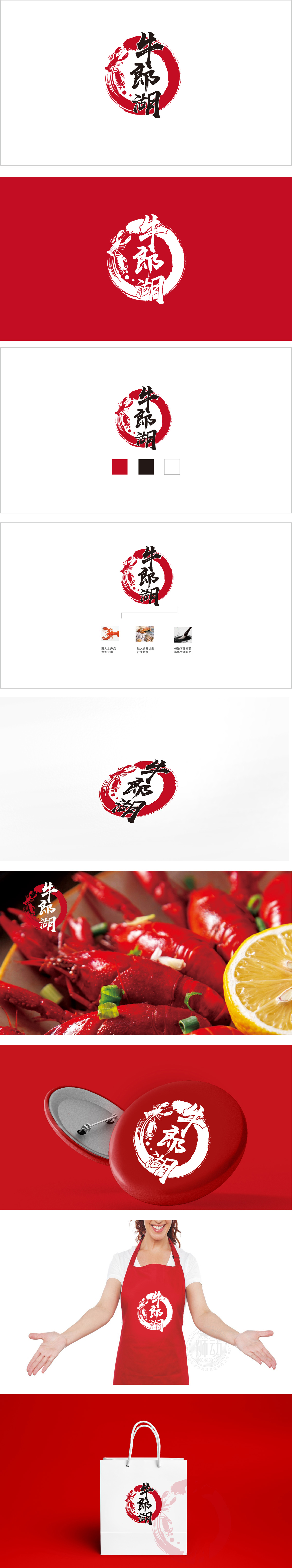
狮动设计用「圆」与「书法」构建强记忆框架,「牛」字笔锋刚劲,起笔收笔有力量感,暗示品牌的「扎实感」;「郎」字用了连笔,笔画流畅,像湖水的波纹,呼应「湖」的灵动;「湖」字的「氵」旁特意写得舒展,仿佛水流在动,强化「湖产」的地域属性。 书法字体的加入,让品牌瞬间有了文化底蕴,,传递出「传统工艺、地道风味」的隐含信息。龙虾的红色与背景圆的红色完全呼应,形成「视觉闭环」,用户看到龙虾,会自然联想到「新鲜、鲜活」的水产品,用「传统符号」(印章、书法)建立文化认同,用「行业元素」(龙虾、螃蟹)锚定品类属性,用「色彩对比」(红黑)强化记忆点,最终实现了「好看、好记、好懂」的品牌视觉目标。
Lion design uses "circle" and "calligraphy" to build a strong memory framework, and the word "cow" is strong and powerful, which implies the brand's "solid sense"; The word "Lang" uses Lian Bi, and the strokes are smooth, like the ripples of the lake, echoing the agility of the lake; The word "Lake" is deliberately stretched next to the word "Tanya", as if the water is moving, strengthening the regional attribute of "Lake Production". With the addition of calligraphy fonts, the brand has an instant cultural connotation and conveys the implicit message of "traditional craftsmanship and authentic flavor". The red color of lobster completely echoes the red color of the background circle.


扫码或拨打添加客服微信


