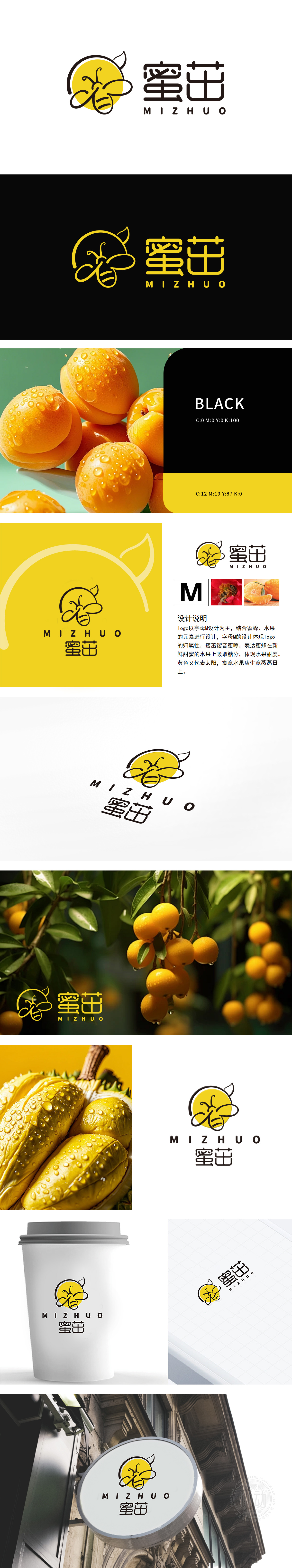
狮动设计采用字母“M”:作为设计的核心,象征公司名称的首字母,增强品牌识别度。蜜蜂与水果:结合蜜蜂在花朵上的形象,传达自然、新鲜和甜蜜的品牌理念。黄色主色调:象征阳光和活力,寓意生意蒸蒸日上。此logo通过蜜蜂与“M”的巧妙结合,形成独特的视觉效果,易于记忆。亮黄色不仅吸引眼球,还传递出温暖和积极的情感,吸引客户。
Lion design uses the letter "M": as the core of the design, it symbolizes the initials of the company name and enhances the brand recognition. Bees and fruits: combine the image of bees on flowers to convey the brand concept of nature, freshness and sweetness. Yellow main color: it symbolizes sunshine and vitality, which means that business is booming. This logo, through the ingenious combination of bees and "M", forms a unique visual effect and is easy to remember.


扫码或拨打添加客服微信


