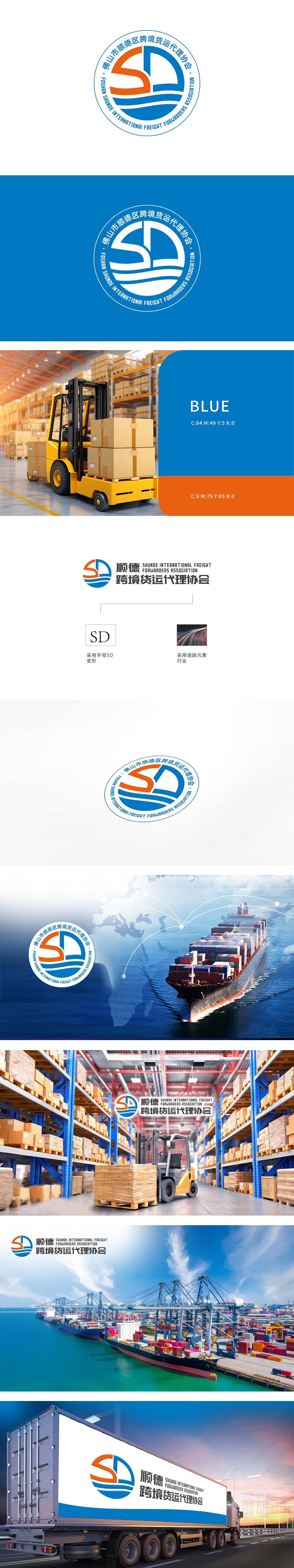
狮动设计采用“SD”字母变形设计,代表“顺德”(Shunde)的首字母,简洁明了,易于识别。道路元素:右侧图案采用道路元素,象征货运行业的运输路径,体现协会的主营业务——跨境货运代理。色彩运用:橙色和蓝色:橙色象征活力与热情,蓝色则代表信任与专业,两者的结合传达了协会积极向上且可靠的形象。该设计通过简洁的视觉语言和明确的行业象征,成功地传达了协会的专业形象和核心价值,给人留下深刻印象。
The design of Lion Motion adopts the letter "SD", which stands for the initials of "Shunde", which is concise and easy to identify. Road element: The pattern on the right side adopts road element, which symbolizes the transportation path of freight industry and reflects the main business of the association-cross-border freight forwarding. Color application: orange and blue: orange symbolizes vitality and enthusiasm, while blue represents trust and professionalism. The combination of the two conveys the positive and reliable image of the association.


扫码或拨打添加客服微信


