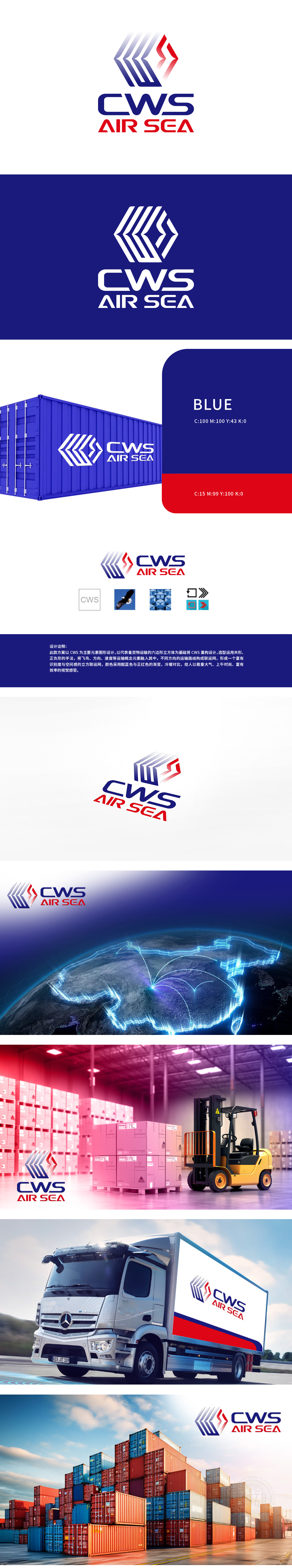
狮动设计采用:以“CWS”字母为基因,通过共形、正负形手法将飞鸟(自由/高效)、六边形立方体(稳固/科技)、方向/速度符号等运输概念融入,构建三维联运网络,象征全球化物流的精准与通达。色彩哲学,激发情感共鸣:靛蓝与正红渐变,冷暖碰撞中传递“稳重信赖”与“活力创新”,契合现代物流高效、可靠且充满动感的行业特质。此LOGO是视觉艺术的呈现,更是战略思维的凝练,深刻诠释了品牌核心价值与行业趋势的融合。
Lion Motion Design adopts: taking the letter "CWS" as the gene, and integrating the transportation concepts such as flying birds (free/efficient), hexagonal cubes (stable/technical) and direction/speed symbols through conformal and positive-negative methods to construct a three-dimensional intermodal network, which symbolizes the accuracy and accessibility of global logistics.Color philosophy, arousing emotional resonance: indigo and true red gradually change, conveying "stable trust" and "dynamic innovation" in the collision between cold and warm.


扫码或拨打添加客服微信


