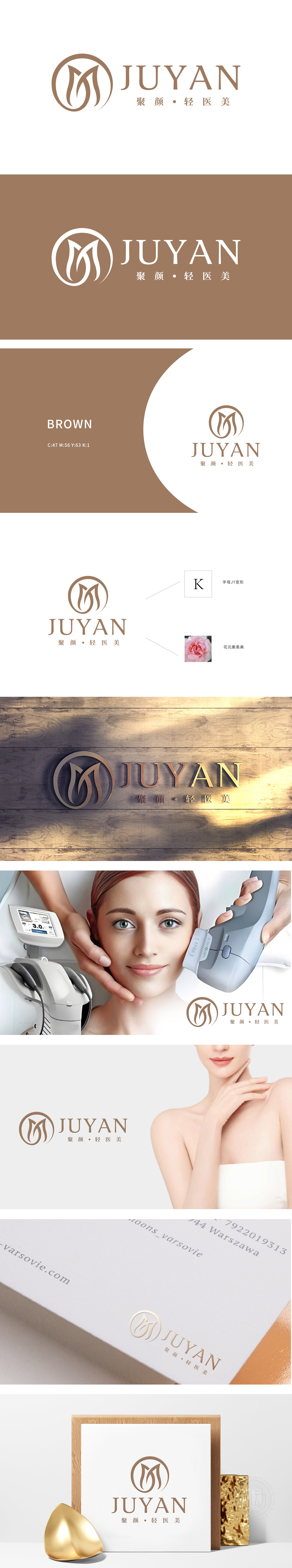
狮动设计采用Logo中的图形部分由字母“J”和“Y”变形组合而成,形成一个类似花瓣的图案,传达出柔美、自然和优雅的感觉,符合“轻医美”的品牌定位。Logo采用了温暖的棕色调,给人一种温馨、可靠和高端的感觉,符合美容行业的定位,整体设计简洁而不失优雅,完美契合了美容行业的特点,传达出专业、可靠和美丽的核心价值。
The design of Lion Motion adopts the combination of the letters "J" and "Y" in the graphic part of Logo, forming a petal-like pattern, conveying the feeling of softness, naturalness and elegance, which is in line with the brand positioning of "Light medical cosmetology". Logo adopts warm earthy tones, giving people a warm, reliable and high-end feeling, which conforms to the positioning of the beauty industry.


扫码或拨打添加客服微信


