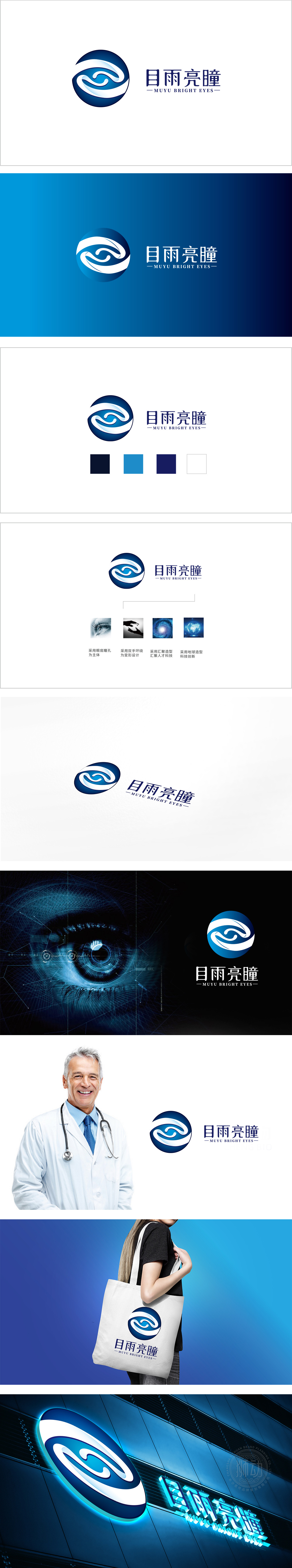
狮动设计采用“圆形+流动波浪”的极简组合,圆形基底: 圆形是“眼睛”“瞳孔”的抽象化,既直接关联“眼健康”的核心场景,又传递“完整、和谐、专业”的信任感。蓝白渐变波浪: 呼应品牌名中的“雨”,传递“滋润、滋养”的眼保健属性 ,波浪的环绕感模拟“双手护持”,隐含“保护、关怀”的服务温度。蓝色:医疗/科技行业的经典色,代表“专业、冷静、可靠”;极简的线条、克制的配色(蓝白)、几何化的造型(圆形、波浪),符合“医疗/科技”行业的“严谨”属性,让用户瞬间联想到“可靠的眼科专家”。
Lion design adopts the minimalist combination of "circle+flowing waves", and the circular base: the circle is the abstraction of "eyes" and "pupils", which not only directly relates to the core scene of "eye health", but also conveys the trust of "integrity, harmony and professionalism". Blue-and-white gradual wave: echoing the "rain" in the brand name, it conveys the eye health care attribute of "moistening and nourishing", and the surrounding feeling of the wave simulates "holding with both hands", implying the service temperature of "protection and care". Blue: the classic color of medical/scientific industry, which stands for "professionalism, calmness and reliability".


扫码或拨打添加客服微信


